
Sobre
PT-BR
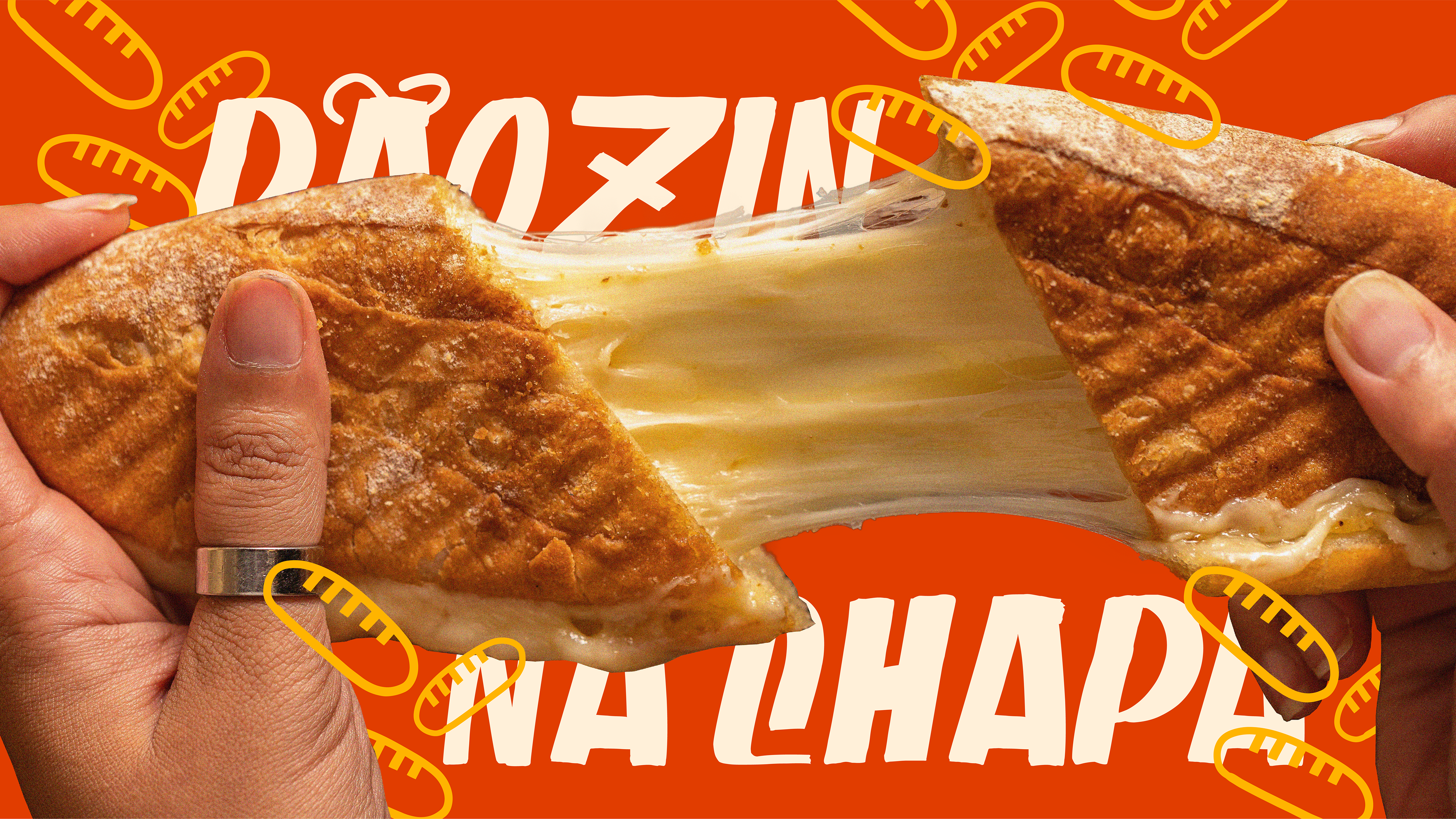
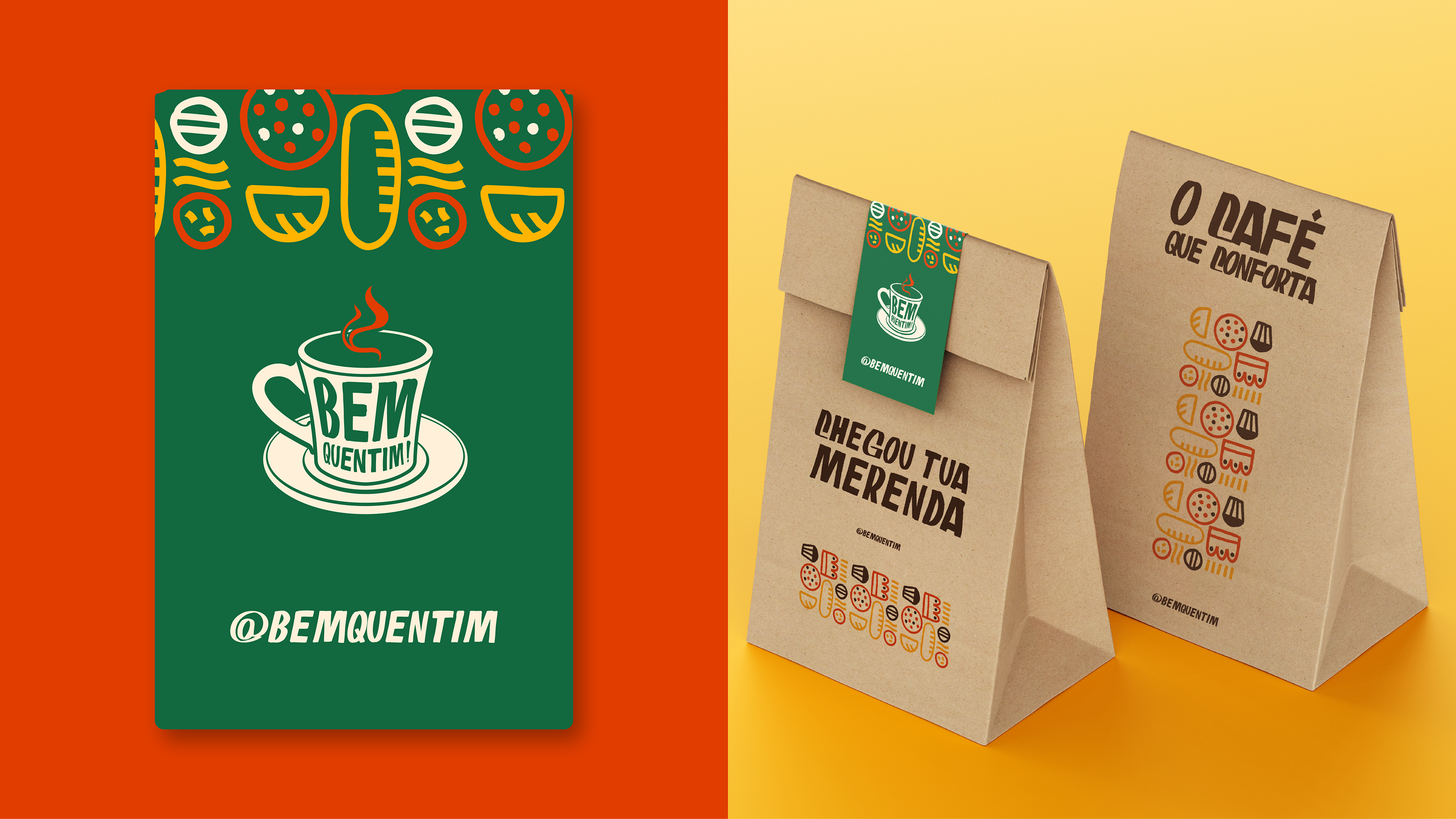
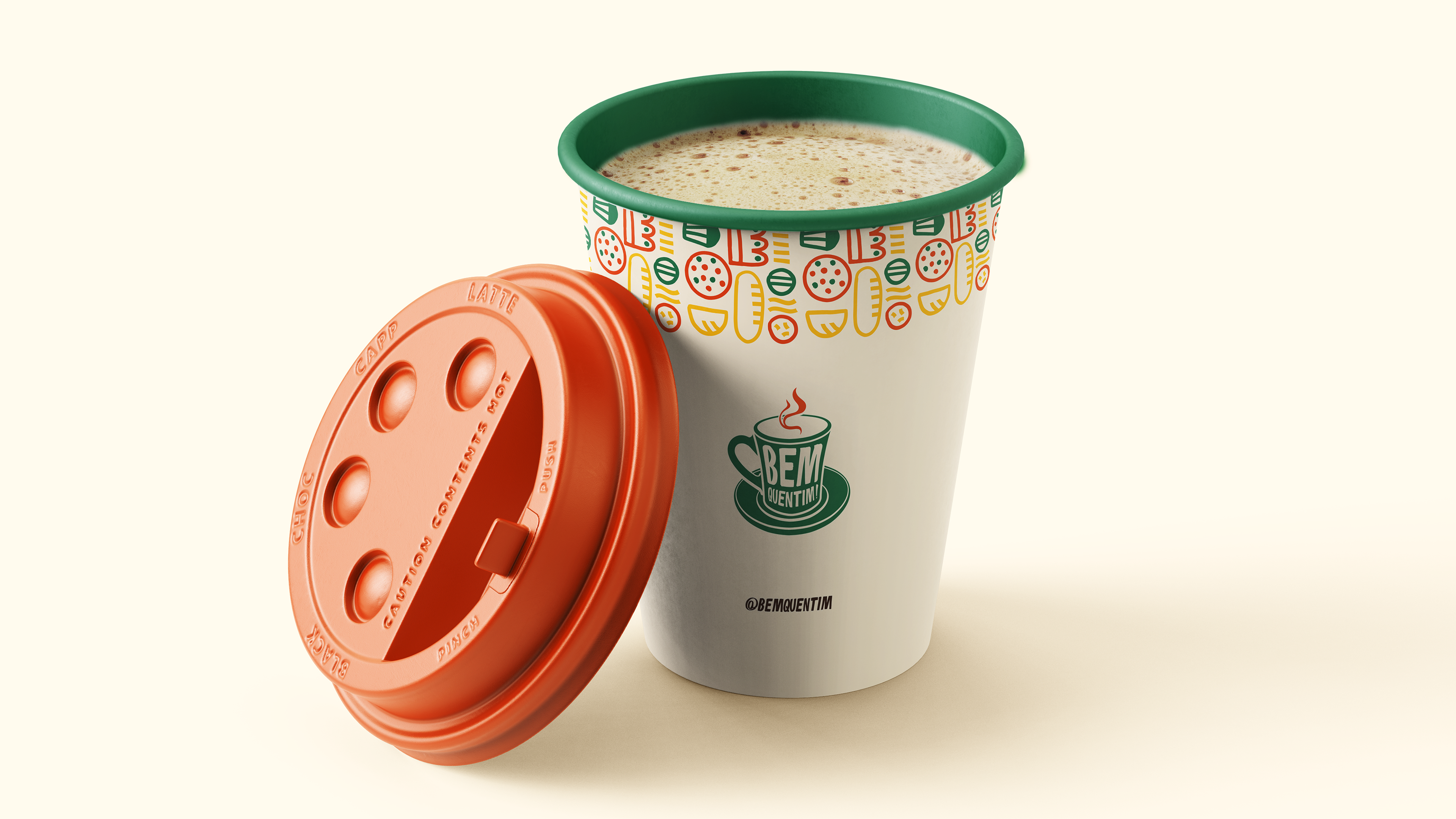
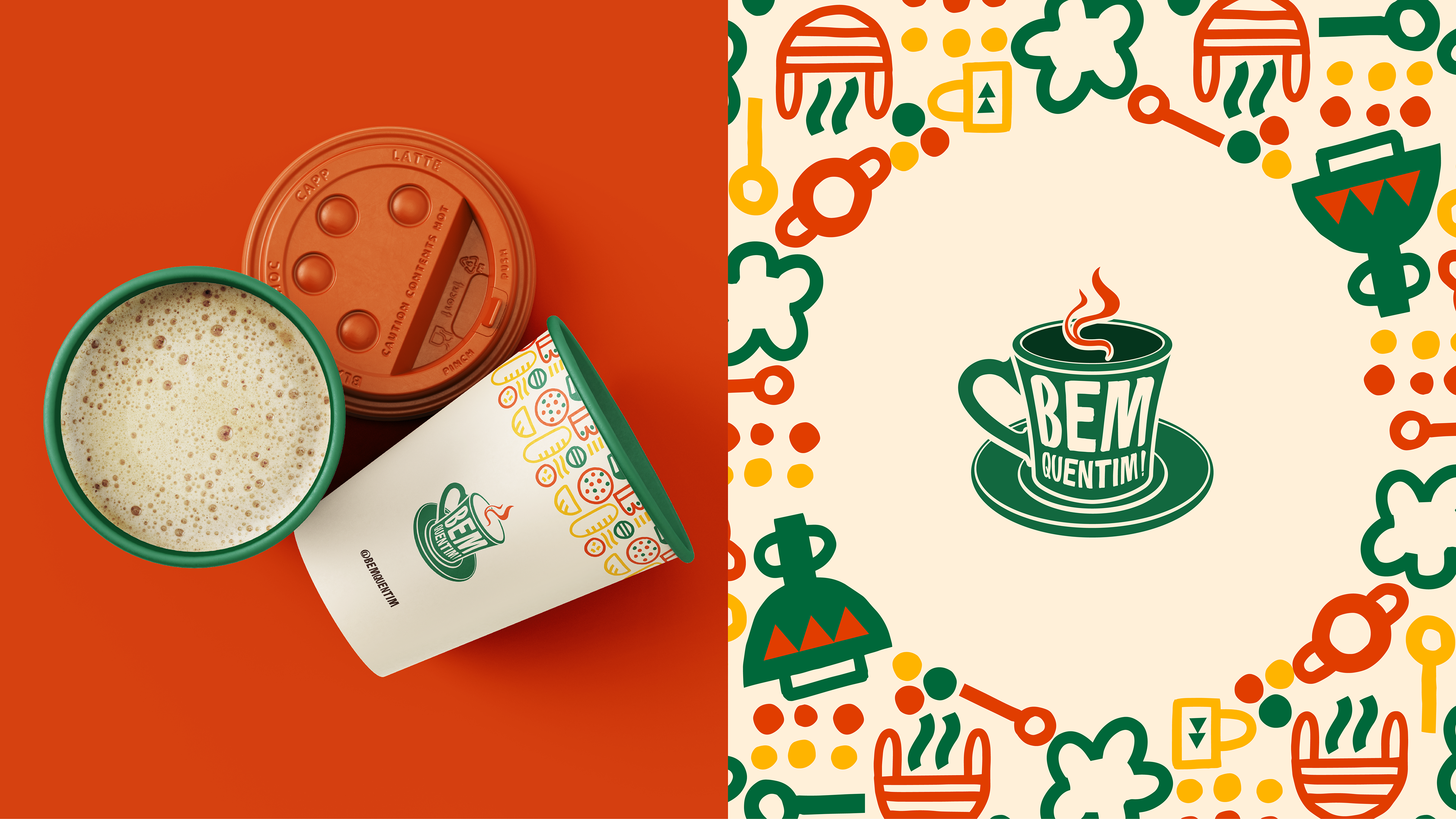
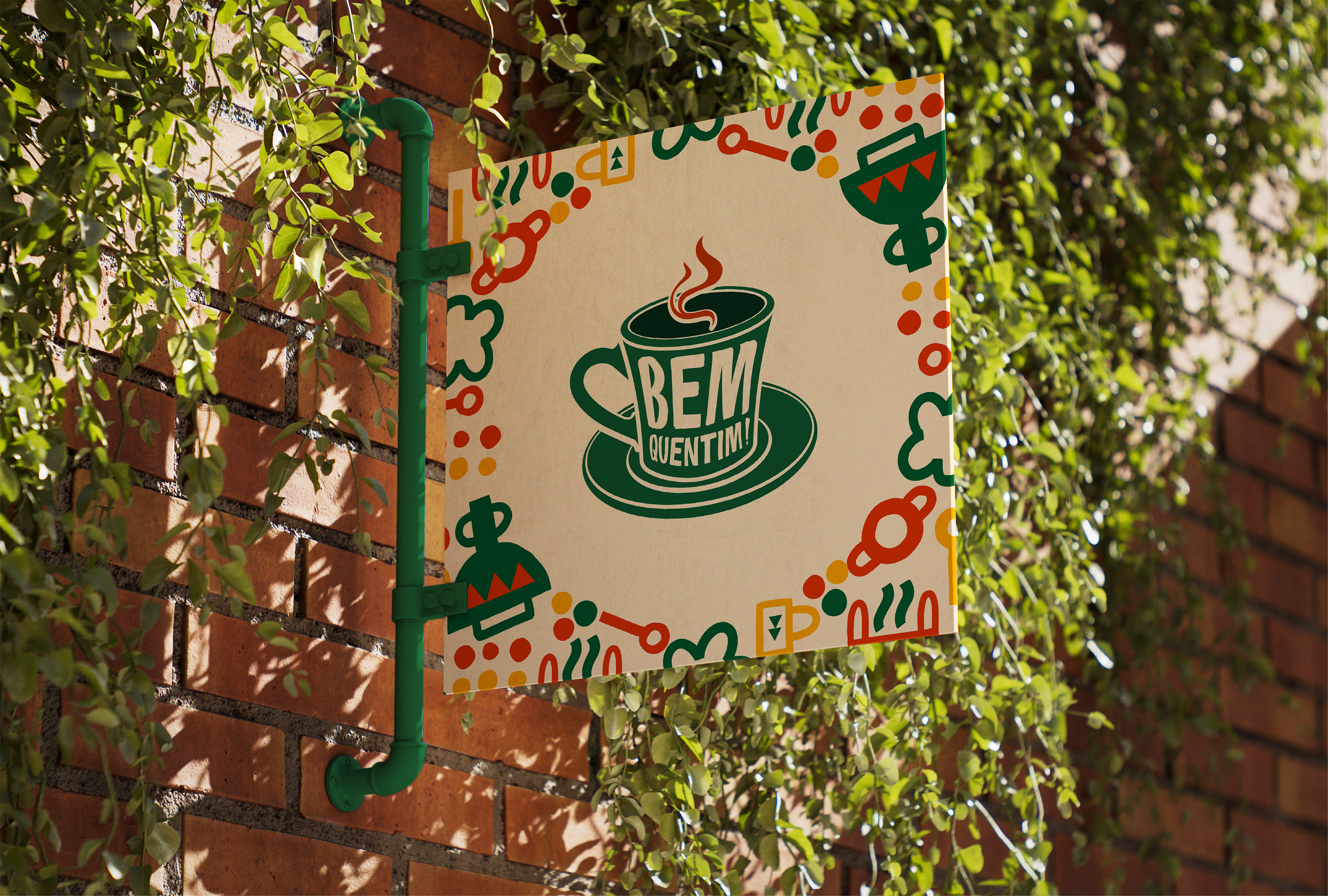
A Bem Quentim é uma cafeteria nordestina localizada em Eusébio, no Ceará, que nasceu com o propósito de aquecer não só o corpo com um café fresquinho, mas também a alma com afeto, cultura e memória. Seu nome traduz exatamente a experiência que oferece: aconchego, tradição e aquele café passado na hora, servido com carinho e sotaque. A identidade visual é vibrante e cheia de personalidade, inspirada nas cores quentes e terrosas do Nordeste — como o verde da vegetação, o amarelo do sol e o vermelho das panelas de barro — unidas em grafismos e padrões que remetem às festas populares, utensílios de cozinha e elementos da culinária regional. A tipografia combina a espontaneidade da fala popular com o cuidado artesanal do design, reforçando a proposta de valorizar o cotidiano simples, mas cheio de significados. O slogan “Meu povo, o café tá pronto!” convida a entrar, partilhar histórias e celebrar as raízes. Na Bem Quentim, cada xícara é uma homenagem à cultura nordestina e ao calor humano que move a região.
EN
Bem Quentim is a Northeastern coffee shop located in Eusébio, Ceará, which was founded with the purpose of warming not only the body with fresh coffee, but also the soul with affection, culture and memories. Its name accurately conveys the experience it offers: comfort, tradition and freshly brewed coffee, served with care and a touch of style. The visual identity is vibrant and full of personality, inspired by the warm, earthy colors of the Northeast — such as the green of the vegetation, the yellow of the sun and the red of the clay pots — combined in graphics and patterns that refer to popular festivals, kitchen utensils and elements of regional cuisine. The typography combines the spontaneity of popular speech with the artisanal care of design, reinforcing the proposal to value simple, yet meaningful, everyday life. The slogan “My people, the coffee is ready!” invites you to come in, share stories and celebrate your roots. At Bem Quentim, each cup is a tribute to Northeastern culture and the human warmth that moves the region.

Logo
PT-BR
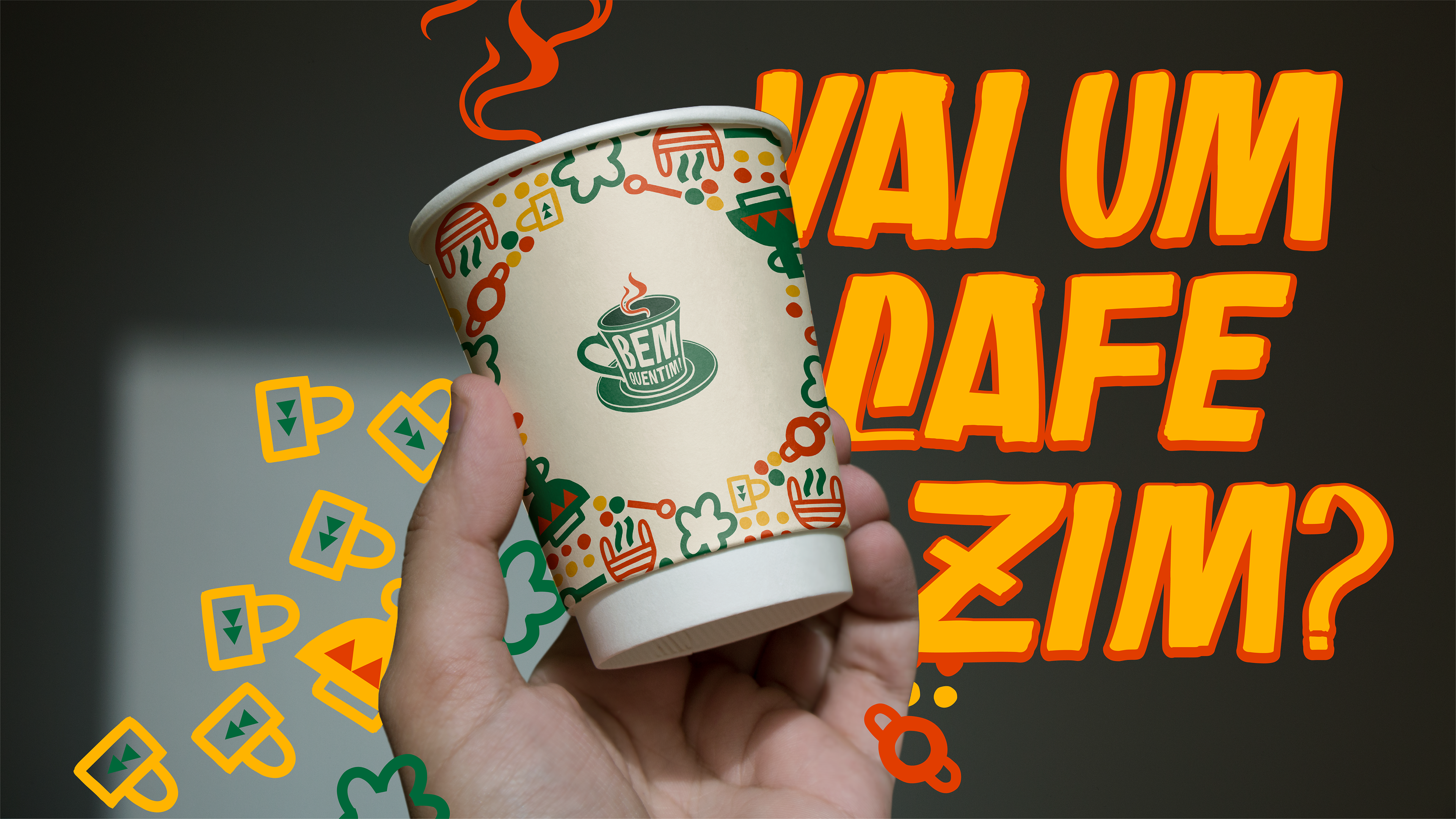
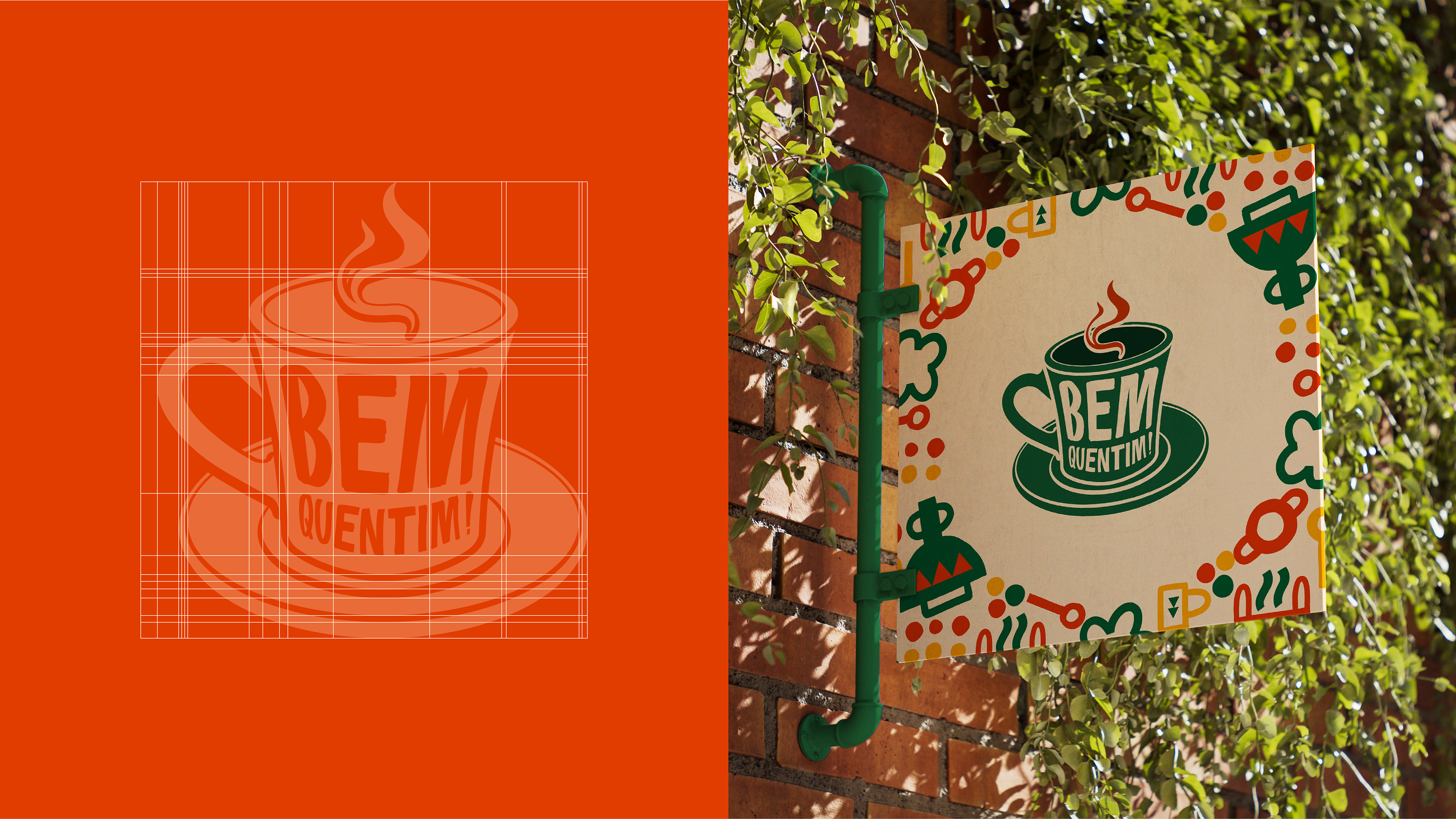
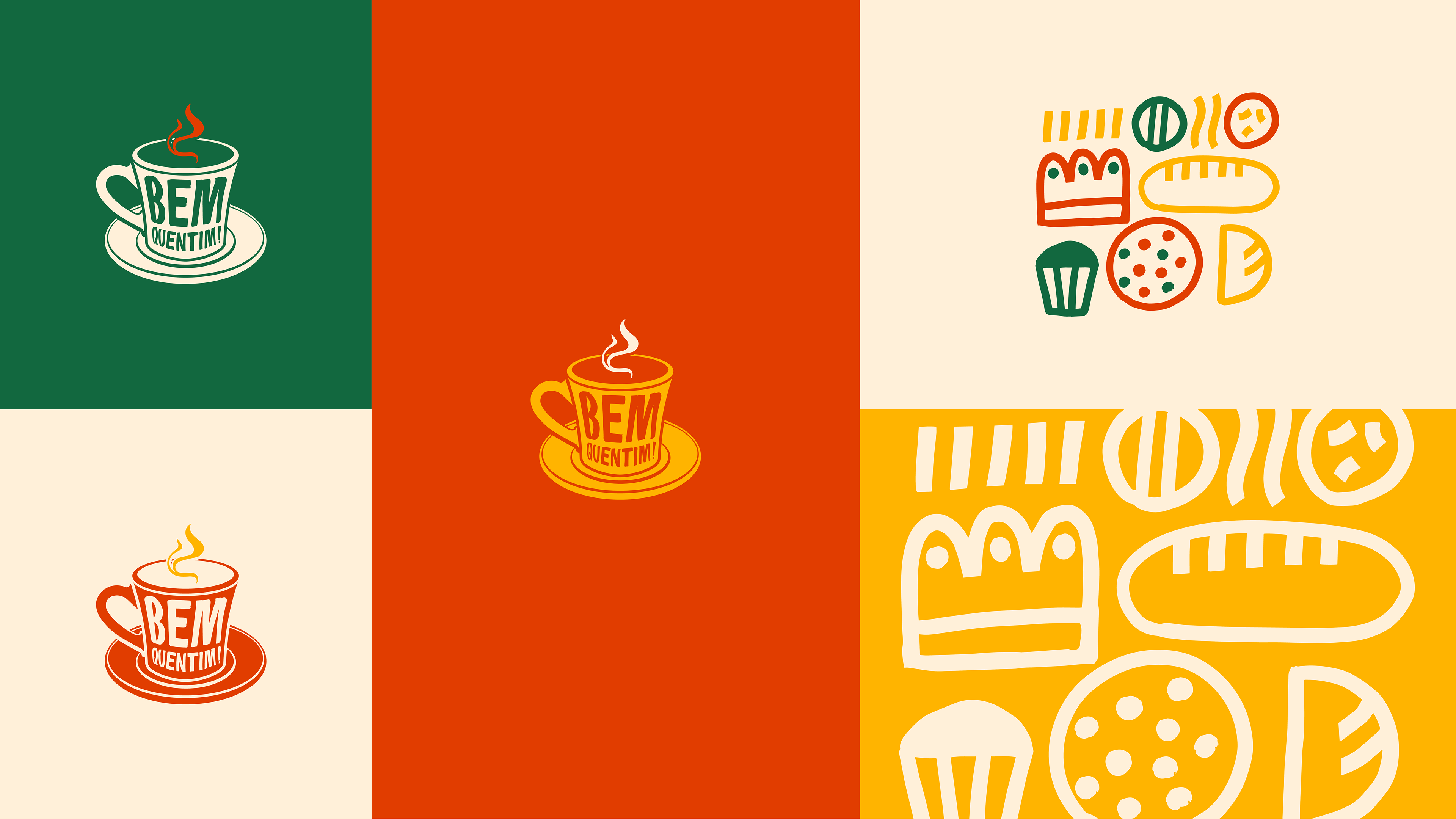
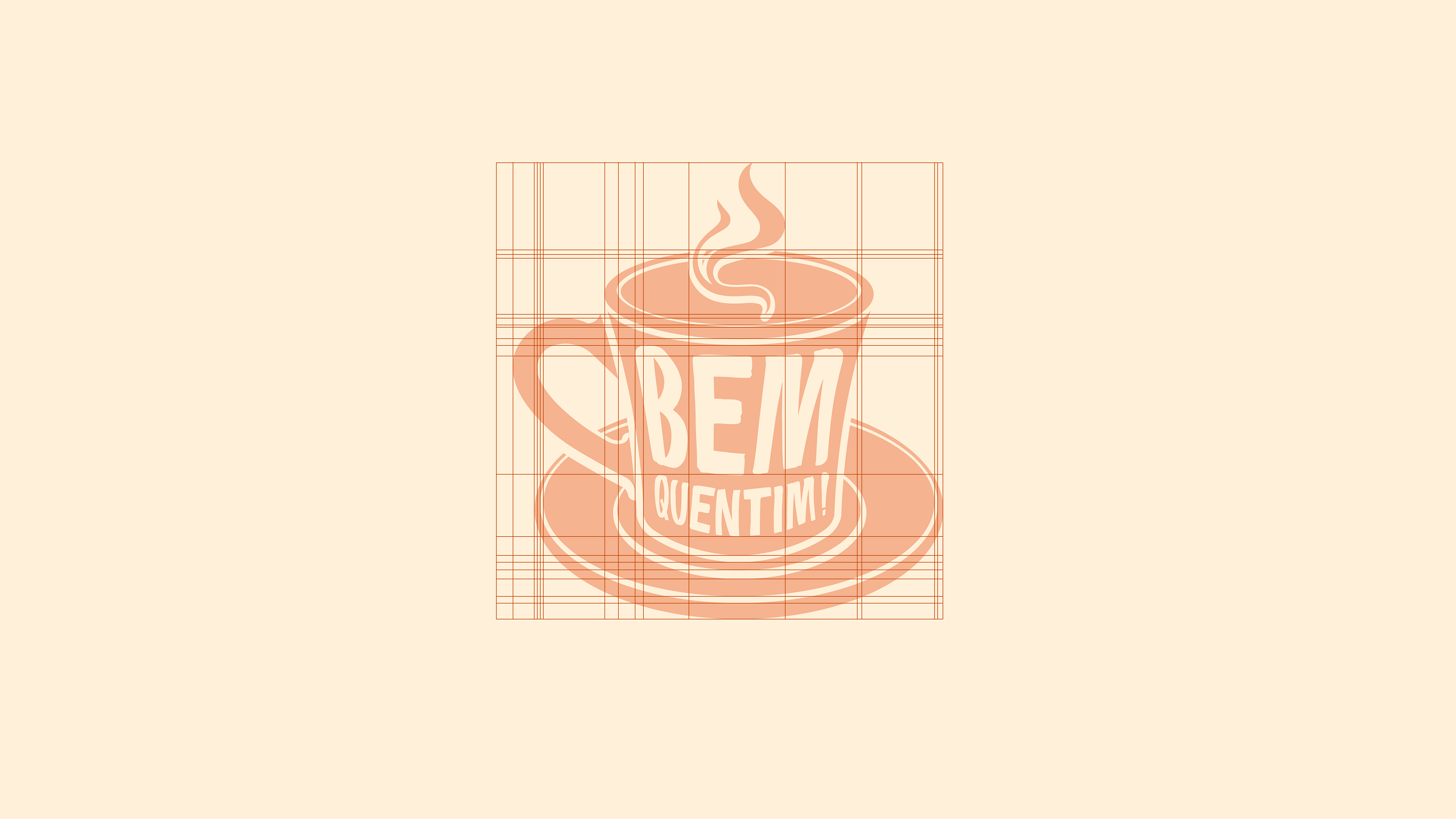
O logo da Bem Quentim é uma construção visual que une de forma criativa e afetiva elementos do design gráfico com referências da cultura nordestina e do universo do café. O ícone principal do logo é uma xícara de café fumegante, estilizada de forma fluida e amigável. A fumaça que sai da xícara se curva suavemente, dando um toque de movimento e acolhimento — remetendo ao calor do café recém-passado e à ideia de aconchego.
EN
The Bem Quentim logo is a visual construction that creatively and affectionately combines elements of graphic design with references to Northeastern culture and the world of coffee. The logo's main icon is a steaming cup of coffee, styled in a fluid and friendly way. The smoke coming out of the cup curves gently, giving a touch of movement and warmth — referring to the warmth of freshly brewed coffee and the idea of comfort.


Paleta de Cores
PT-BR
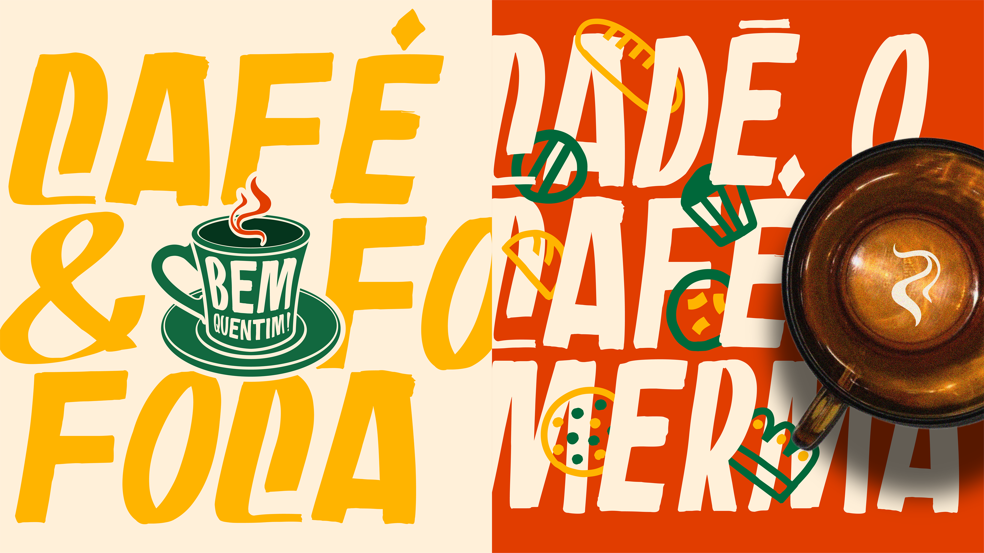
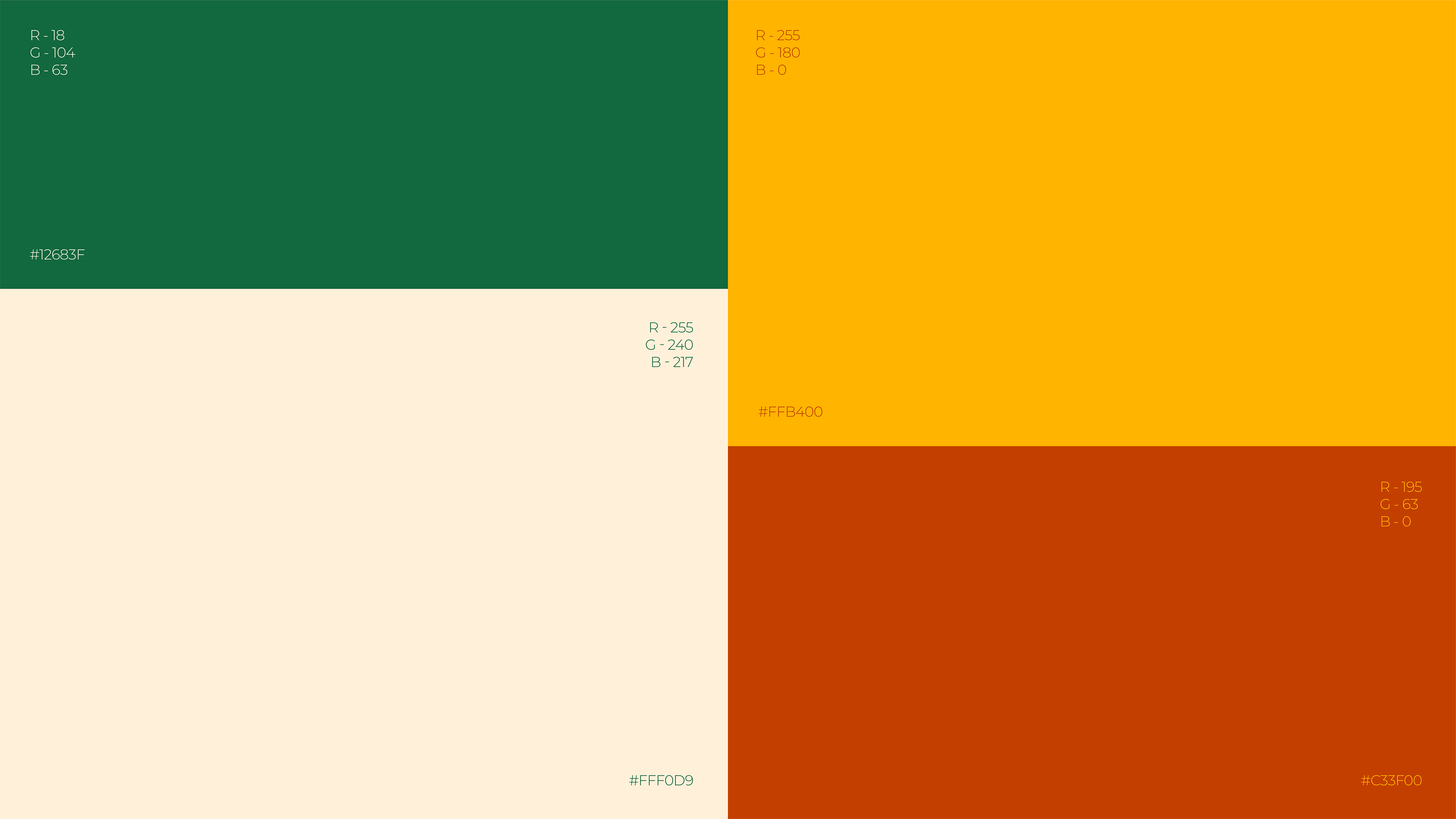
A paleta de cores da Bem Quentim foi desenvolvida para traduzir visualmente a essência calorosa, afetiva e vibrante do Nordeste brasileiro. O verde (#12683F) representa a natureza e o frescor do café passado na hora; o amarelo (#FFB400) traz a energia do sol nordestino e o calor humano; o vermelho-terroso (#C33F00) remete às panelas de barro e à rusticidade das raízes culturais; e o tom creme (#FFF0D9) equilibra a composição com leveza e acolhimento. Juntas, essas cores evocam tradição, alegria e autenticidade — os principais pilares da marca.
EN
Bem Quentim’s color palette was developed to visually convey the warm, affectionate and vibrant essence of the Brazilian Northeast. Green (#12683F) represents nature and the freshness of freshly brewed coffee; yellow (#FFB400) brings the energy of the Northeastern sun and human warmth; earthy red (#C33F00) refers to clay pots and the rusticity of cultural roots; and cream (#FFF0D9) balances the composition with lightness and warmth. Together, these colors evoke tradition, joy and authenticity — the brand’s main pillars.