
A TWO Studio | Branding
PT-BR
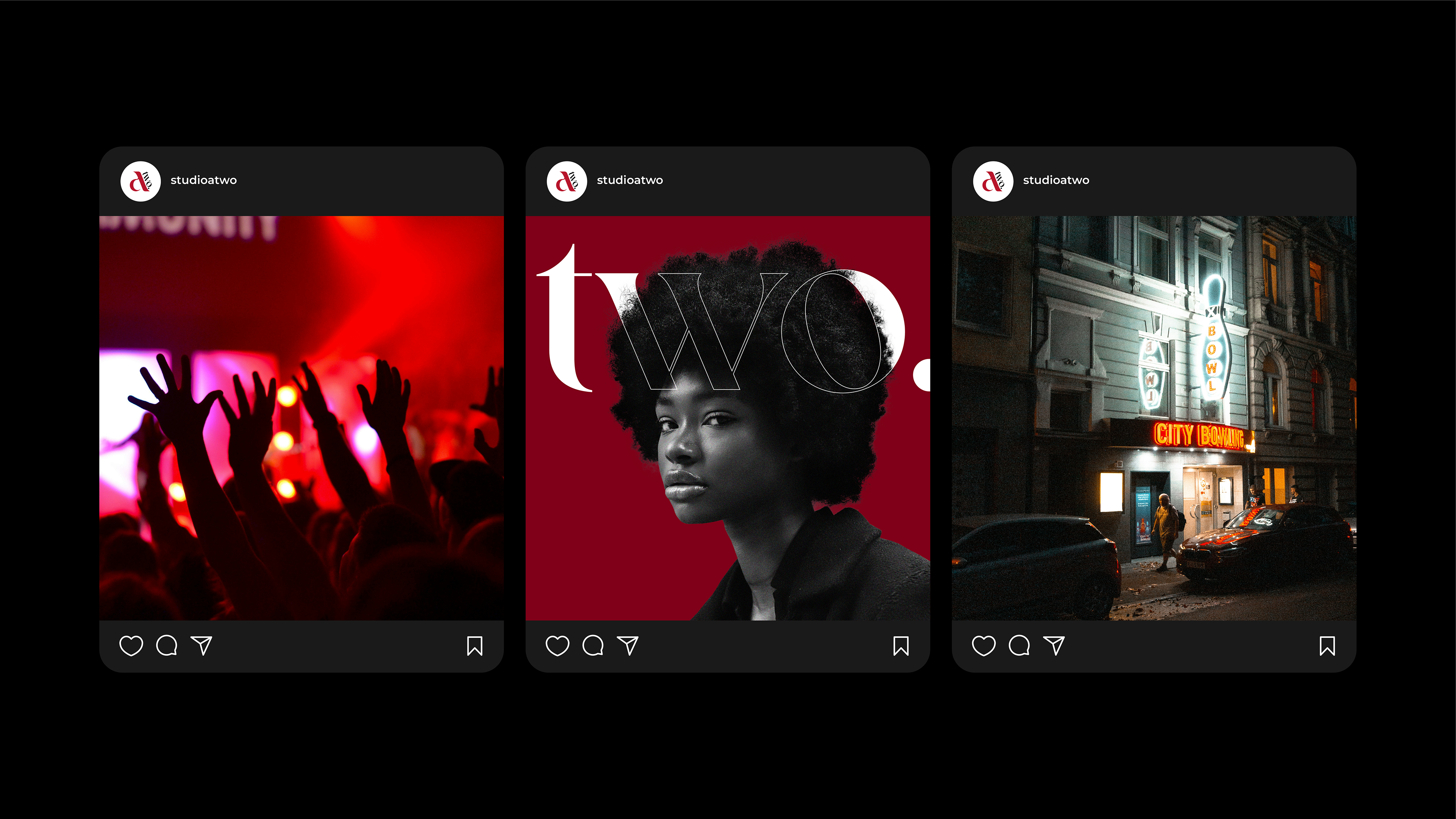
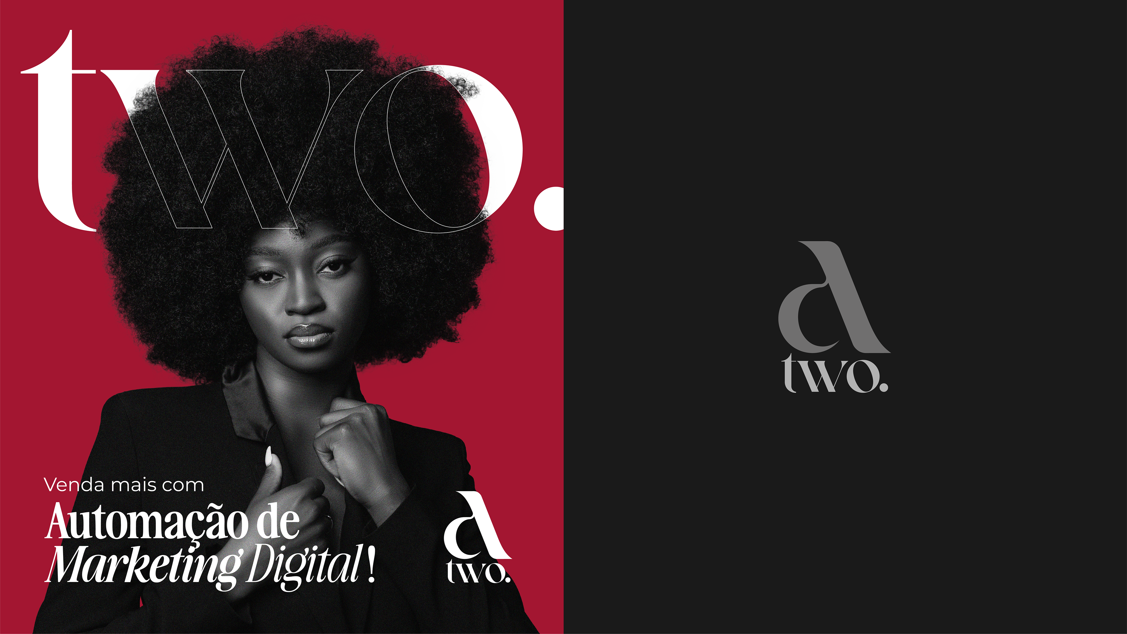
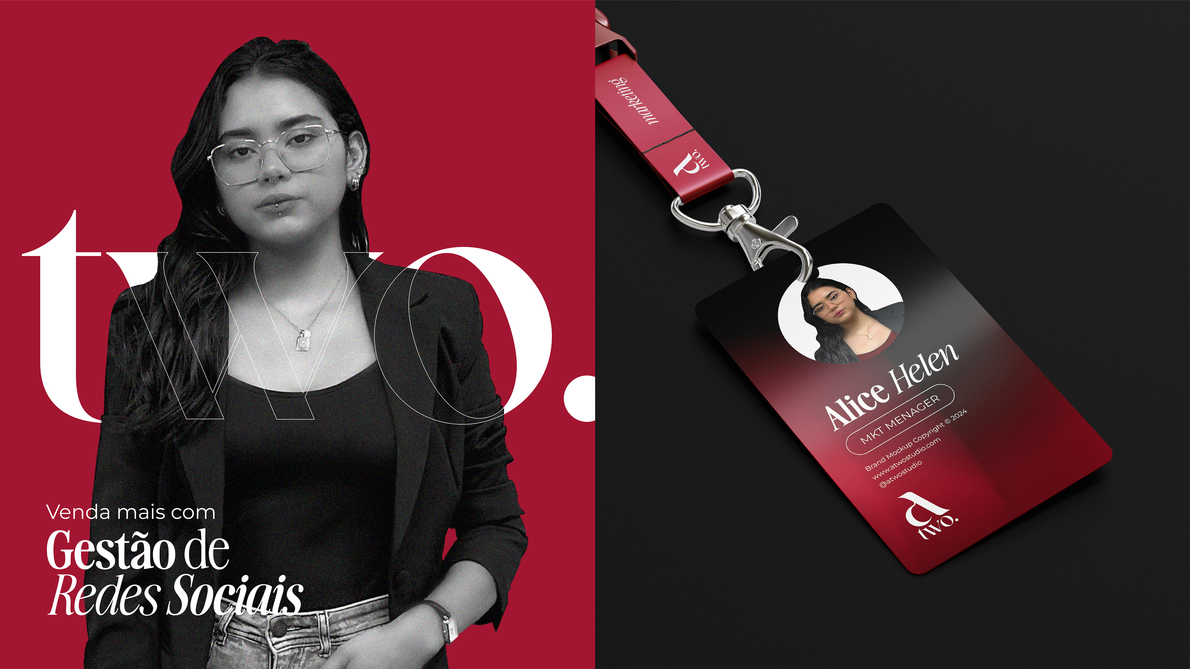
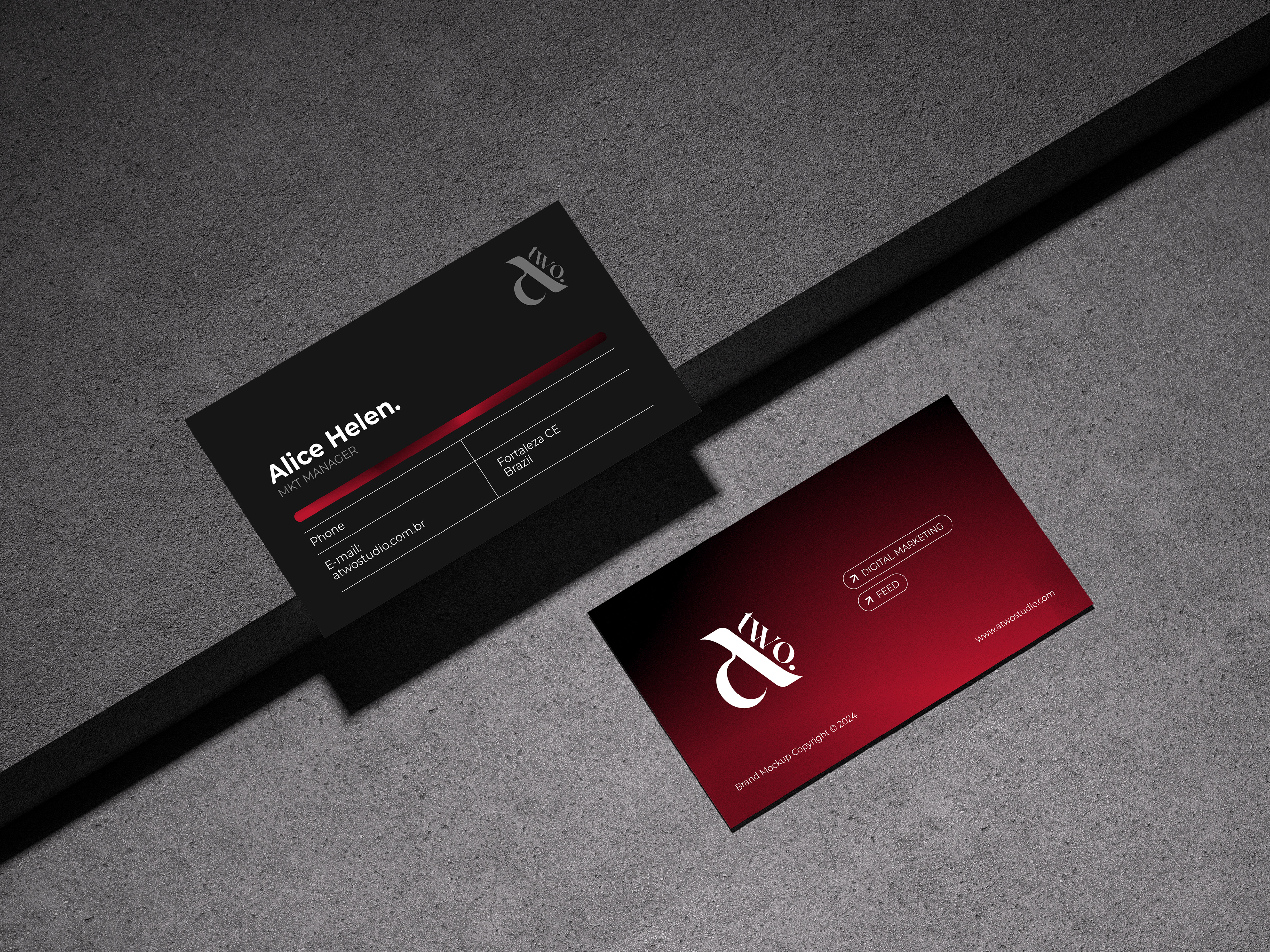
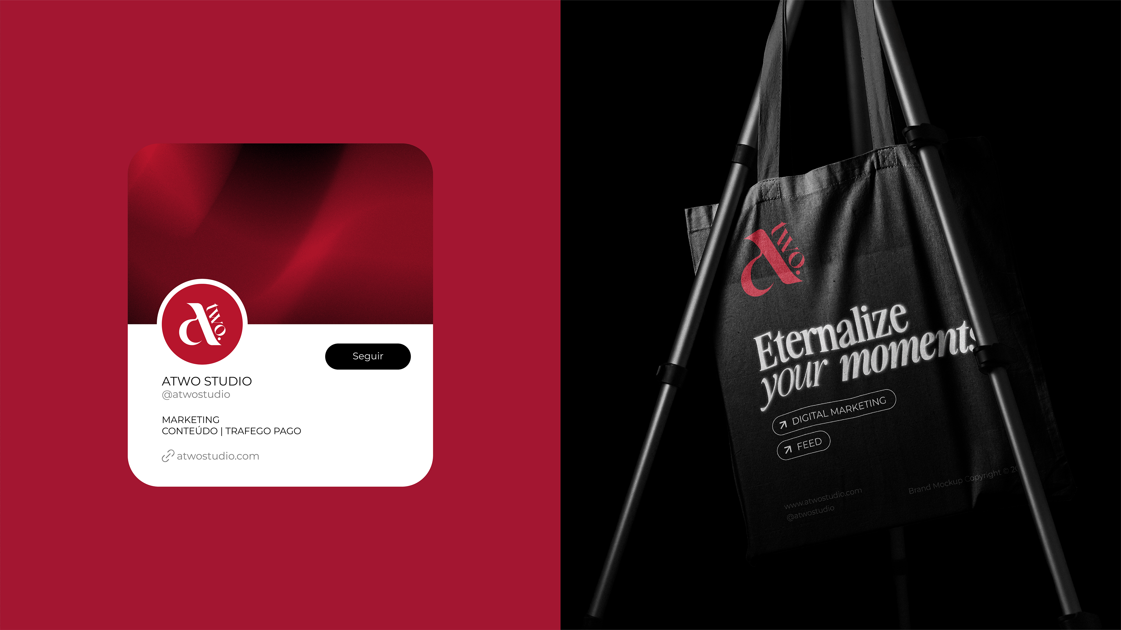
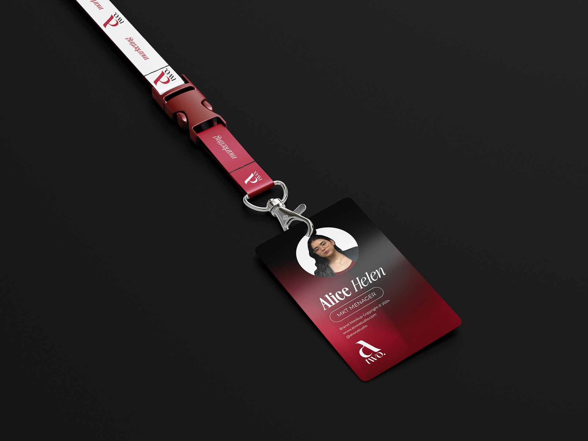
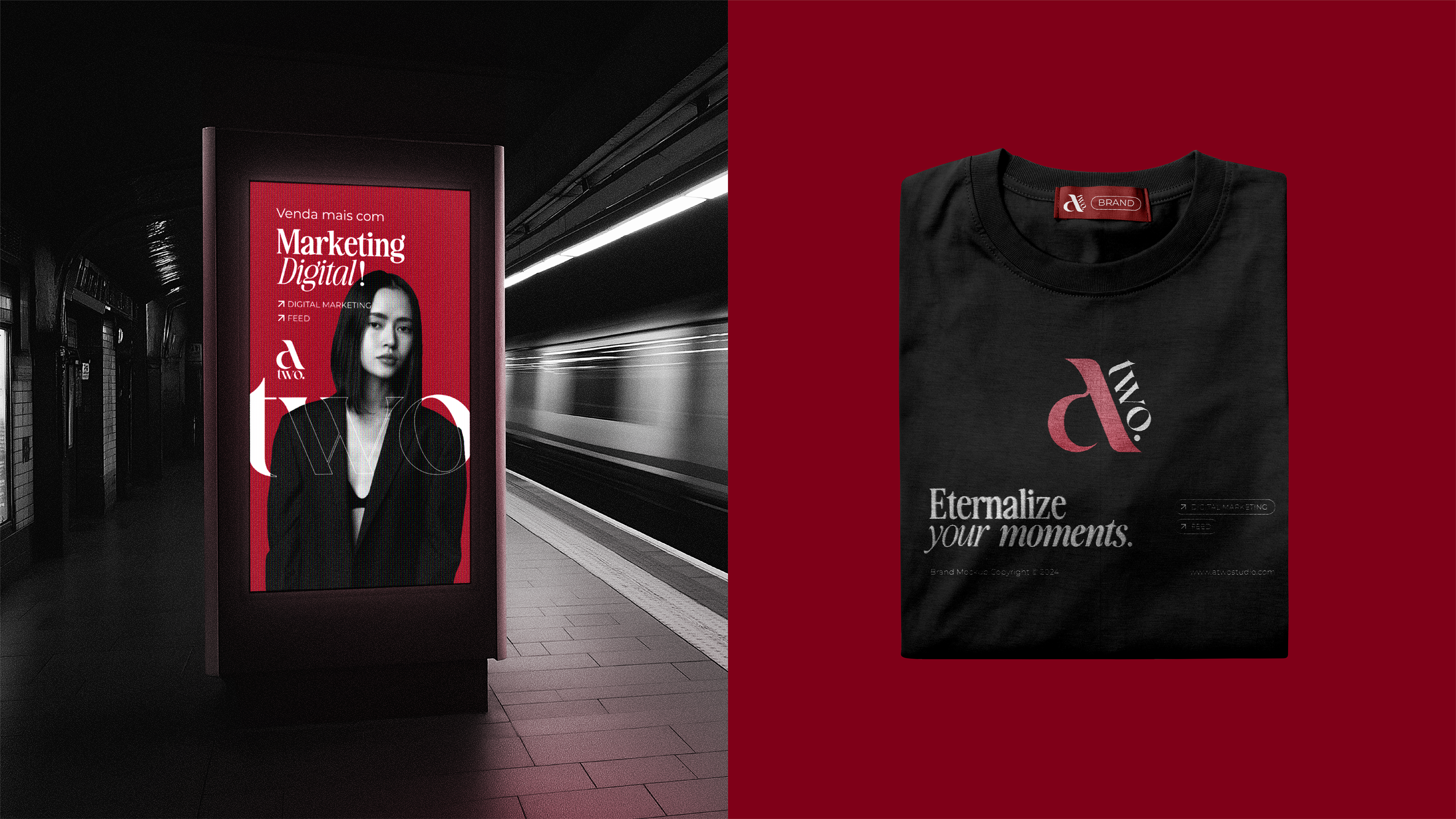
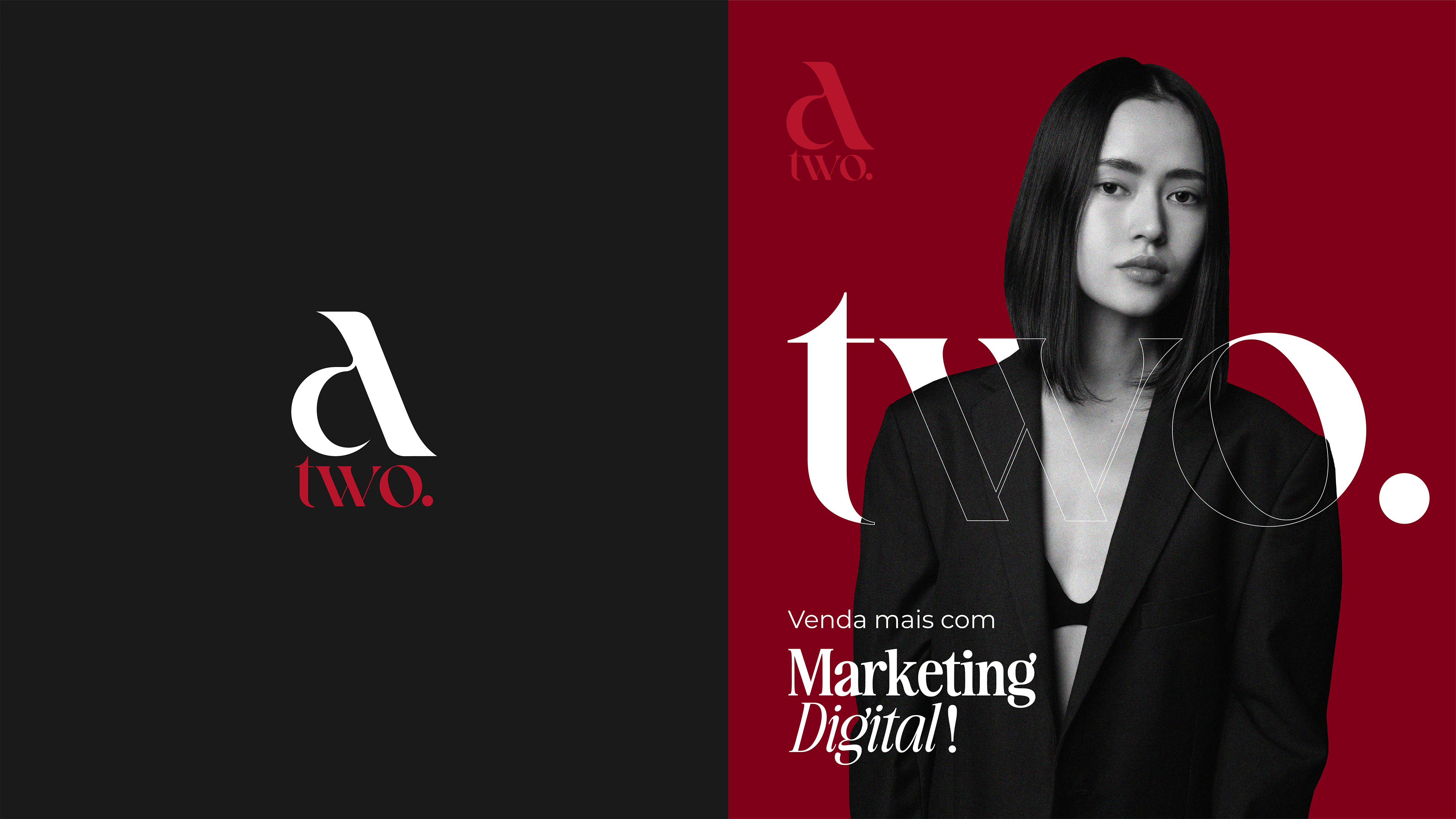
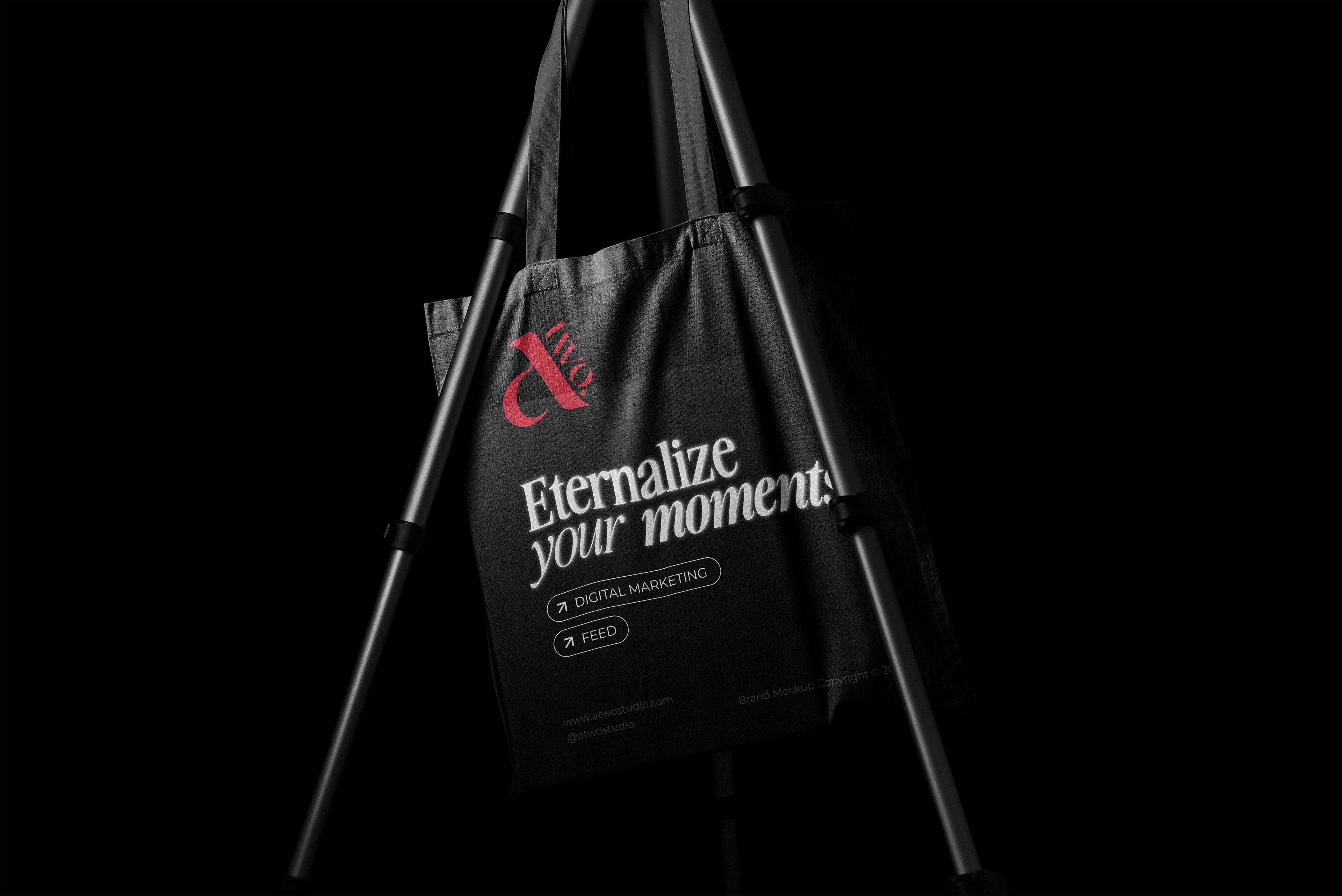
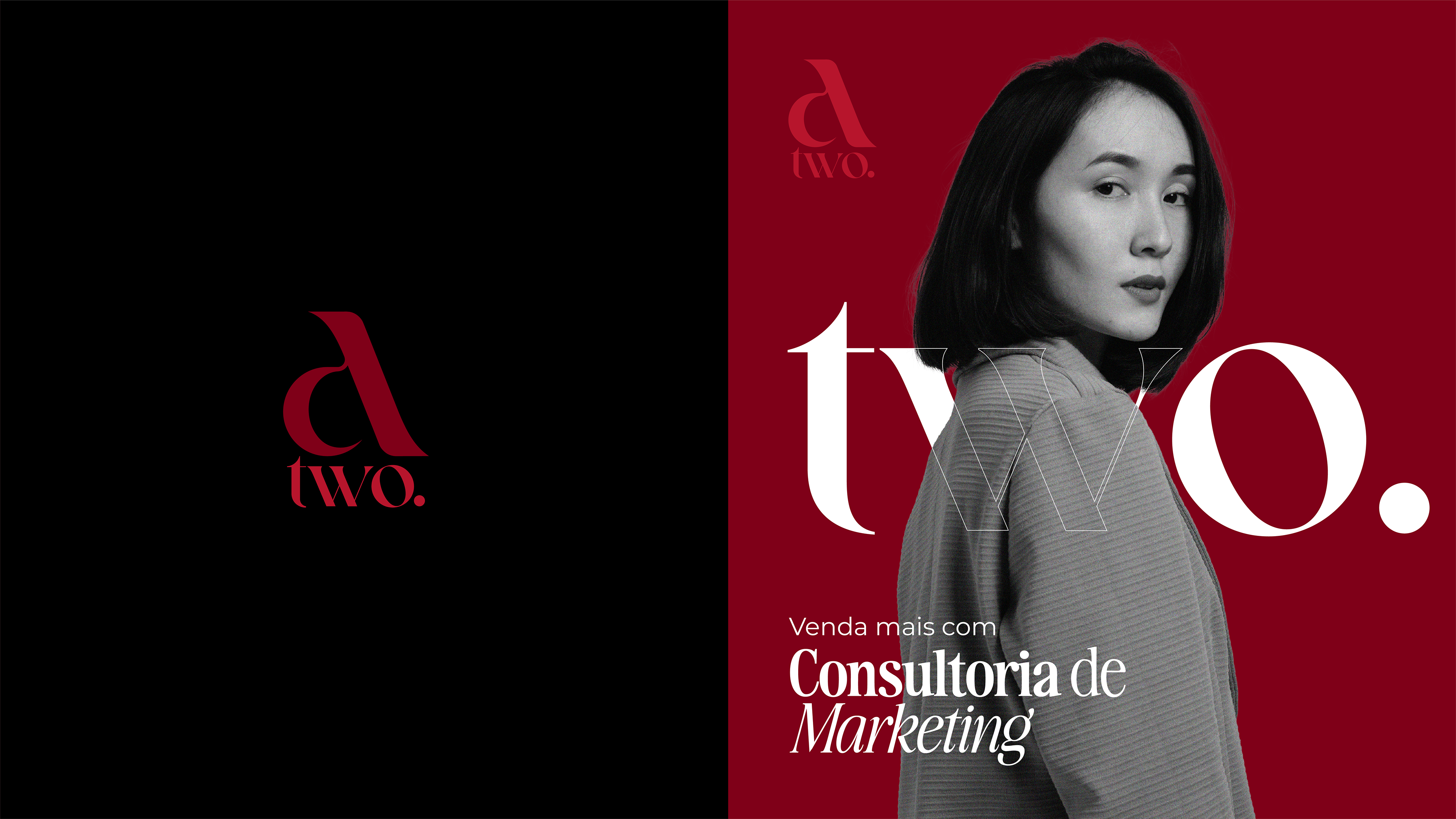
A TWO Studio é uma agência de marketing digital que atua em Fortaleza/Ce e região Metropolitana. Desenvolvida por Alice Helen, atualmente, tem como foco a produção de conteúdo e cobertura de eventos em tempo real expandindo o negócio ao ramo de tráfego pago e gerenciamento em marketing digital. A marca, com seus elementos visuais, busca uma excelente comunicação ao exibir sua identidade com toque vintage, mas sem perder a elegância e a modernidade em seus traços visuais.
EN
TWO Studio is a digital marketing agency that operates in Fortaleza/Ce and the Metropolitan region. Developed by Alice Helen, it currently focuses on producing content and covering events in real time, expanding the business into paid traffic and digital marketing management. The brand, with its visual elements, seeks excellent communication by displaying its identity with a vintage touch, but without losing the elegance and modernity in its visual features.
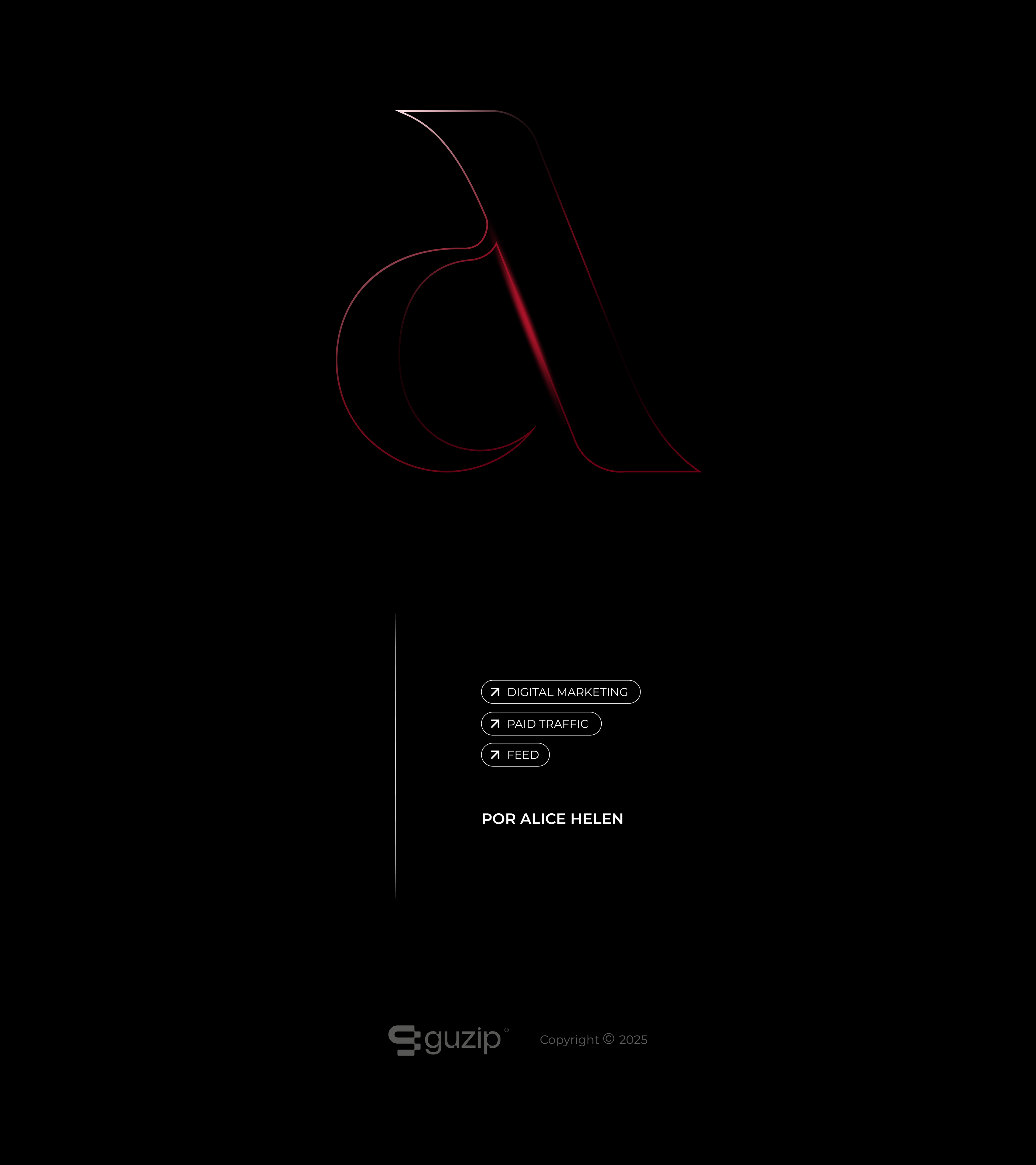
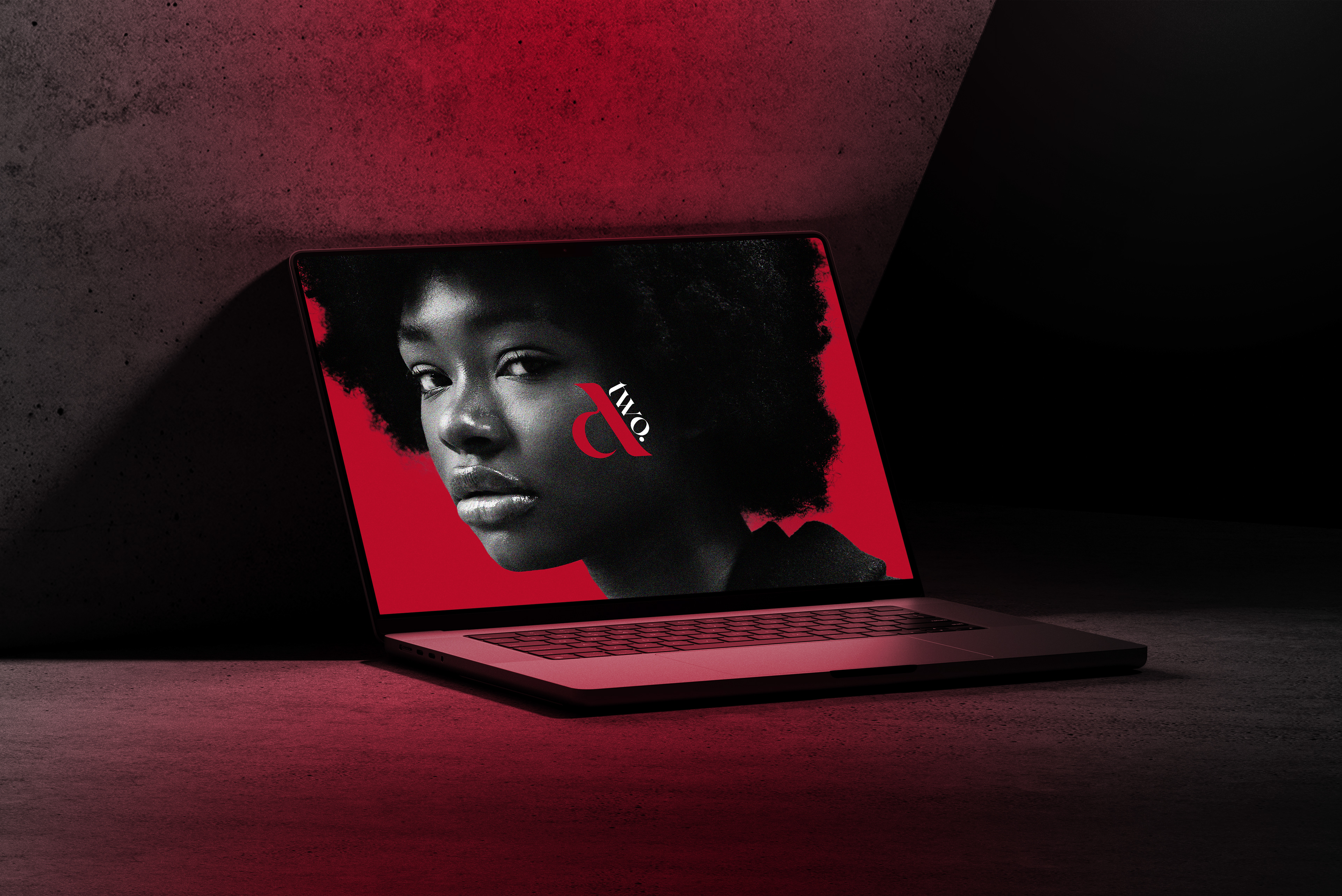
Logo
PT-BR
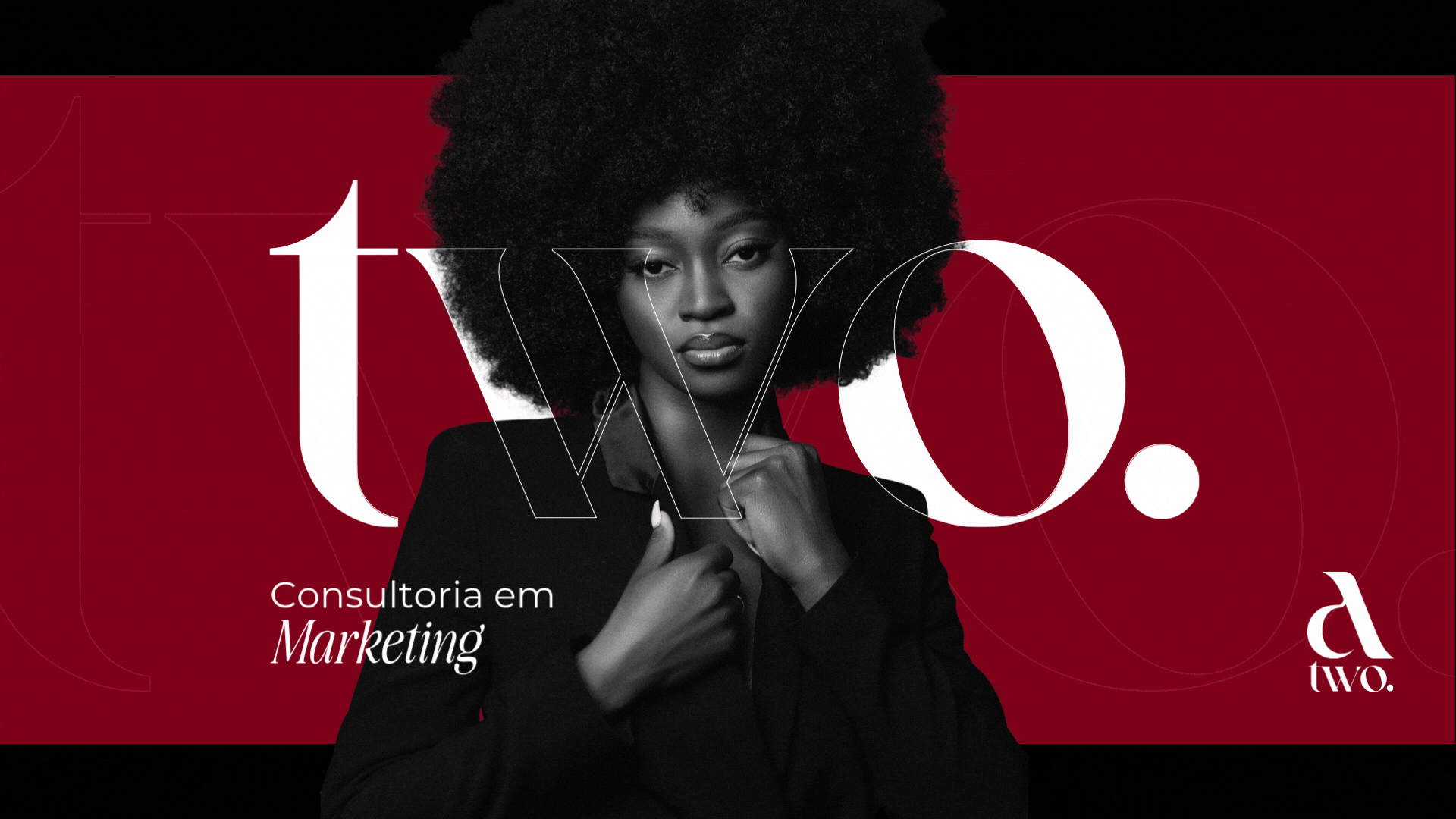
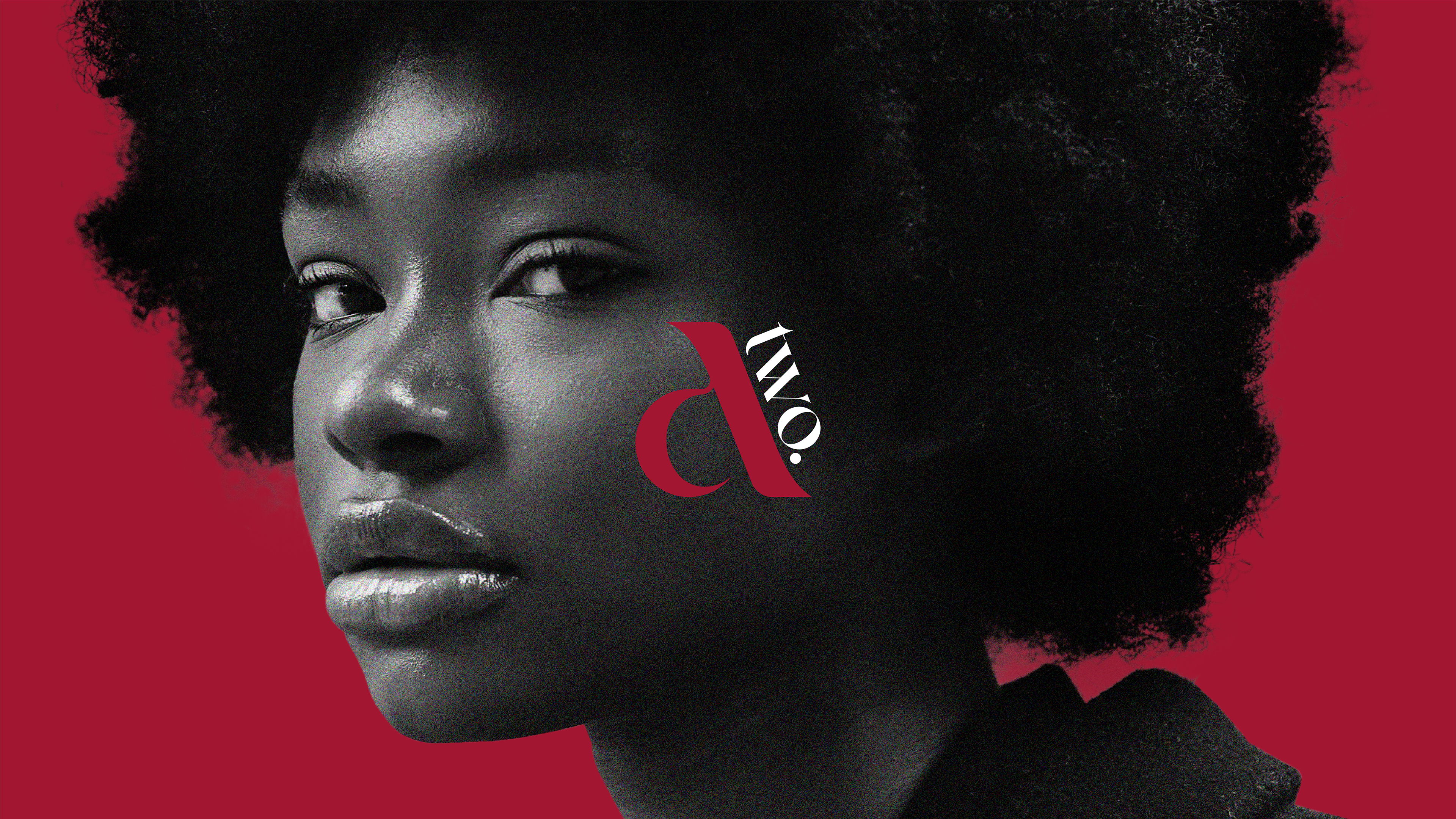
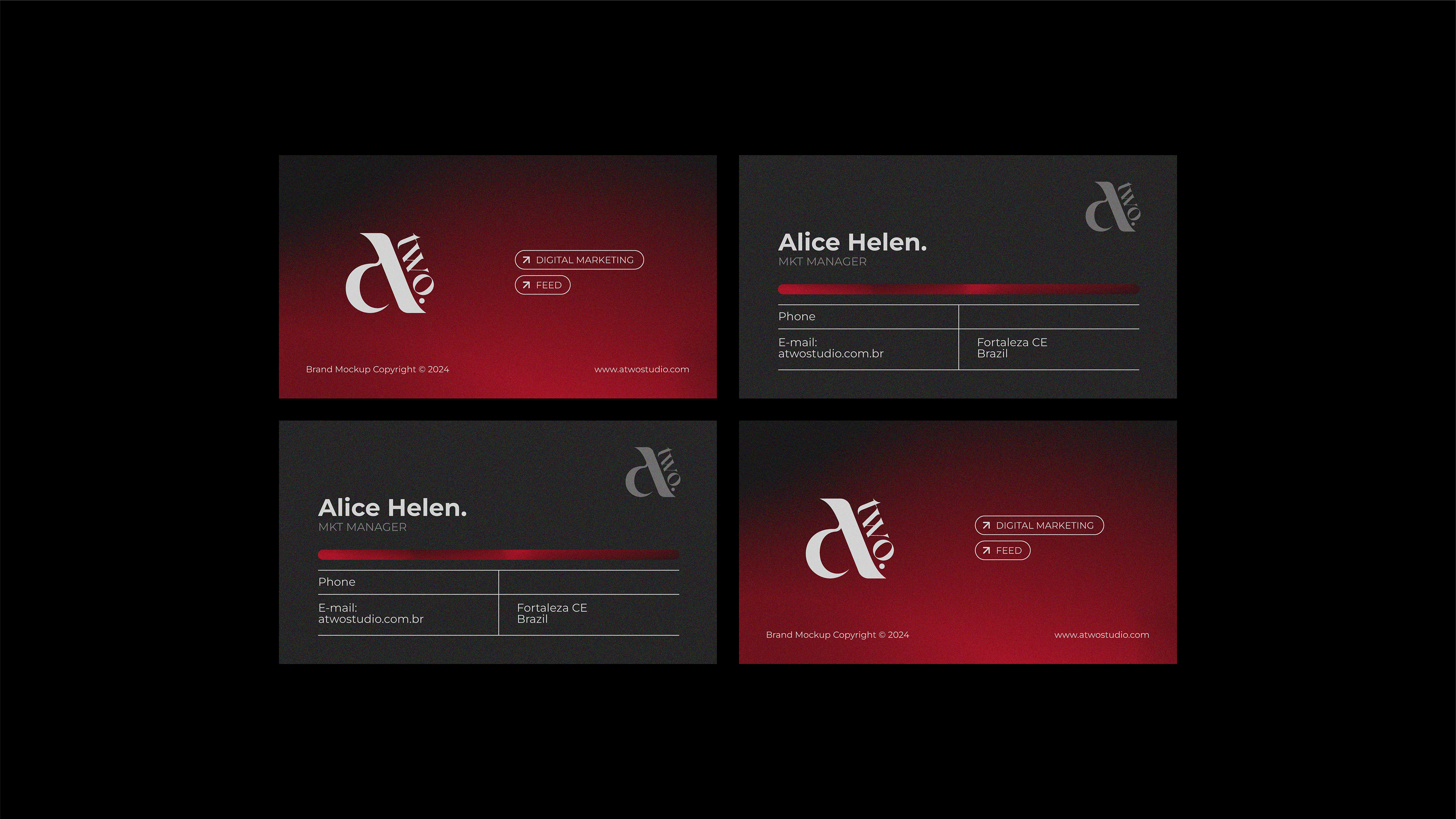
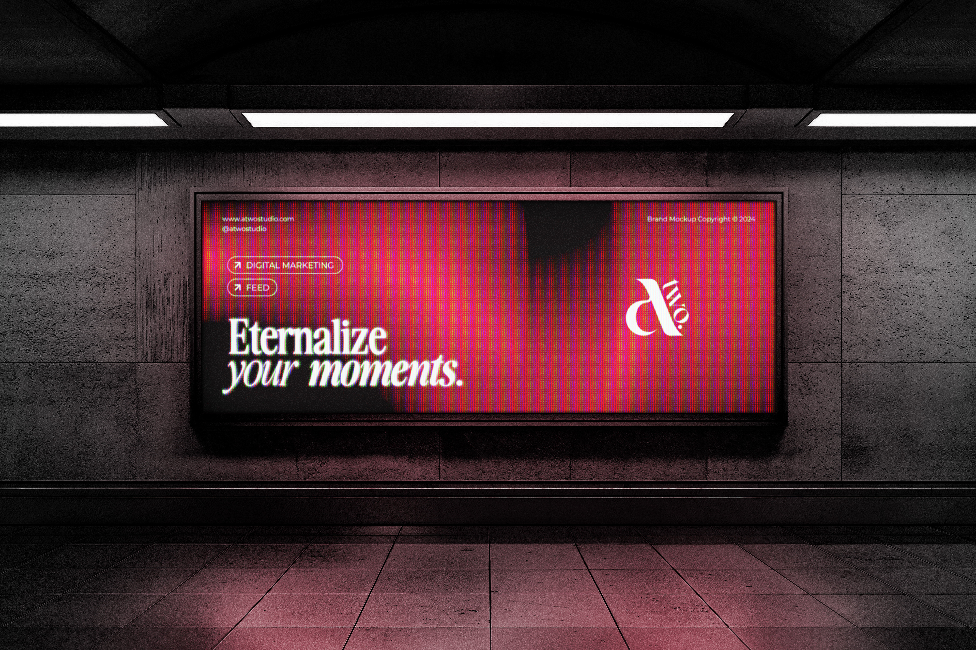
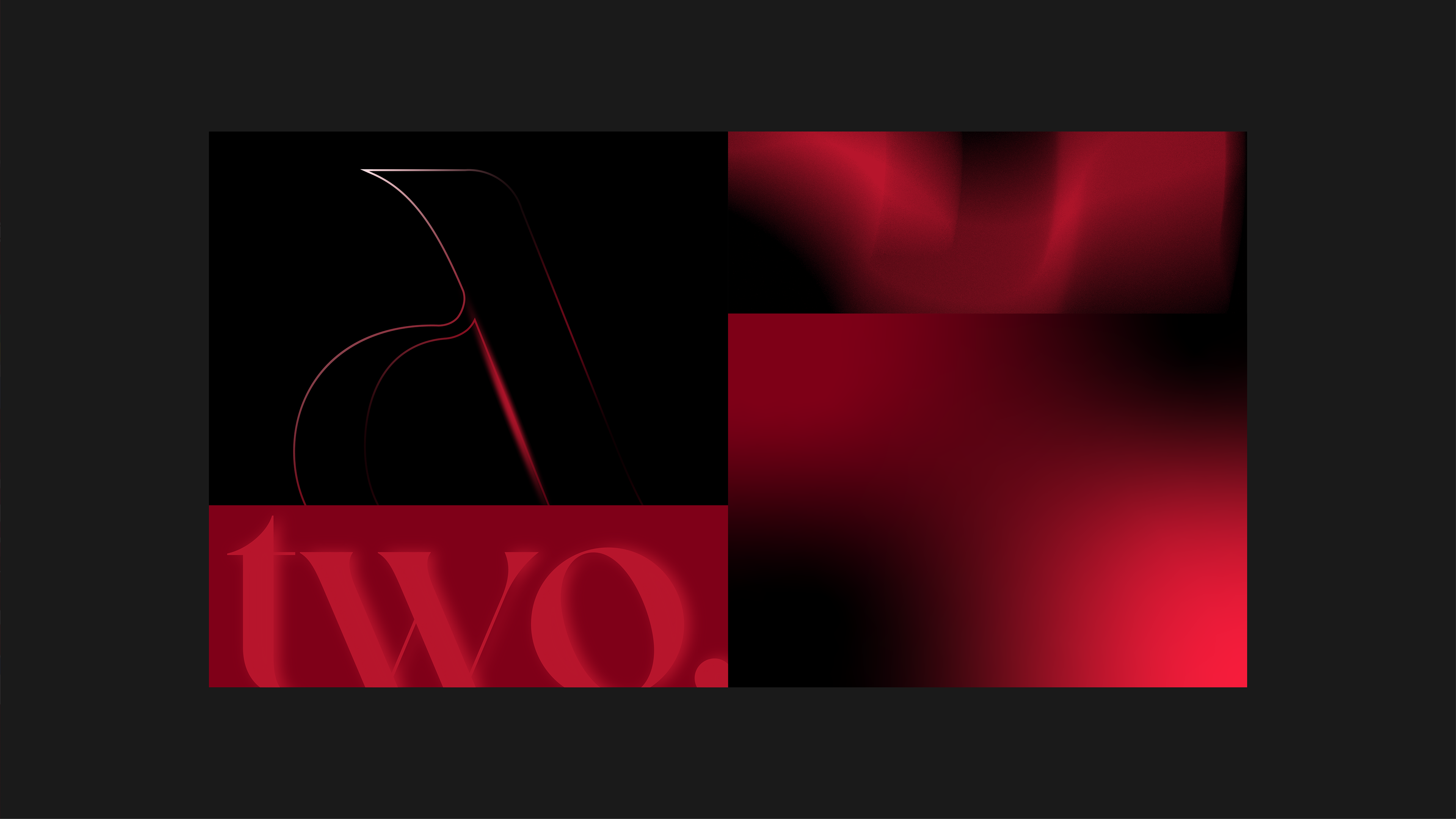
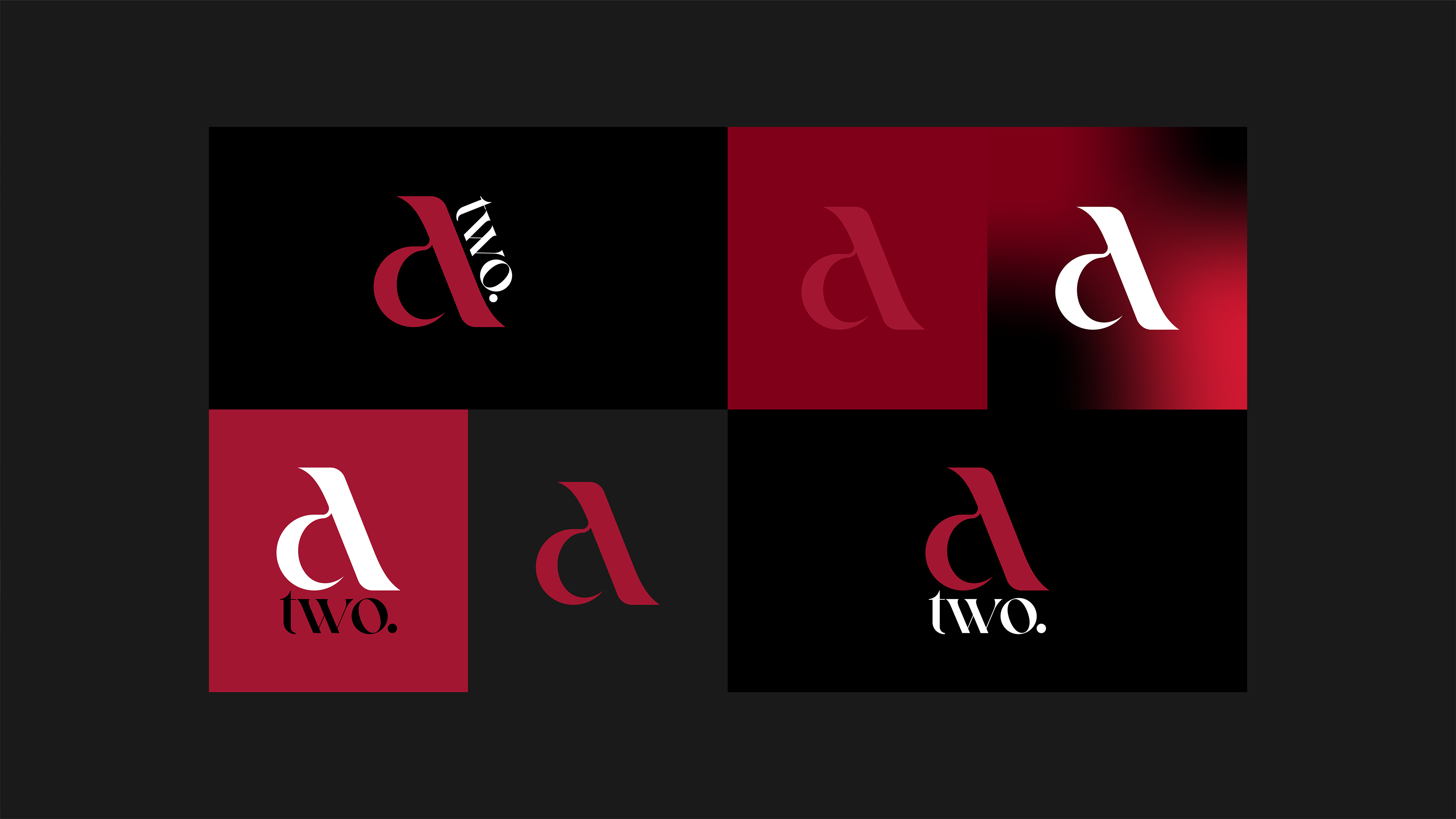
A construção principal utiliza uma letra minúscula estilizada ("a") como base. A tipografia é serifada, o que agrega elegância e tradição ao design. Sobre a perna direita da letra "a", o termo "two." é posicionado diagonalmente. Isso adiciona dinamismo e interesse visual à composição. O fundo vermelho vivo cria contraste forte com os elementos textuais em branco, destacando a marca e tornando-a atraente. Com o minimalismo, o espaço em branco com a simplicidade na composição destacam o logotipo, mantendo-o limpo e impactante. O design combina tradicionalidade e modernidade, transmitindo sofisticação e clareza.
EN
The main construction uses a stylized lowercase letter ("a") as a base. The typography is serifed, which adds elegance and tradition to the design. On the right leg of the letter "a", the term "two." is positioned diagonally. This adds dynamism and visual interest to the composition. The bright red background creates strong contrast with the white textual elements, highlighting the brand and making it attractive. With minimalism, the white space with the simplicity of the composition highlights the logo, keeping it clean and impactful. The design combines traditionality and modernity, conveying sophistication and clarity.
PT-BR
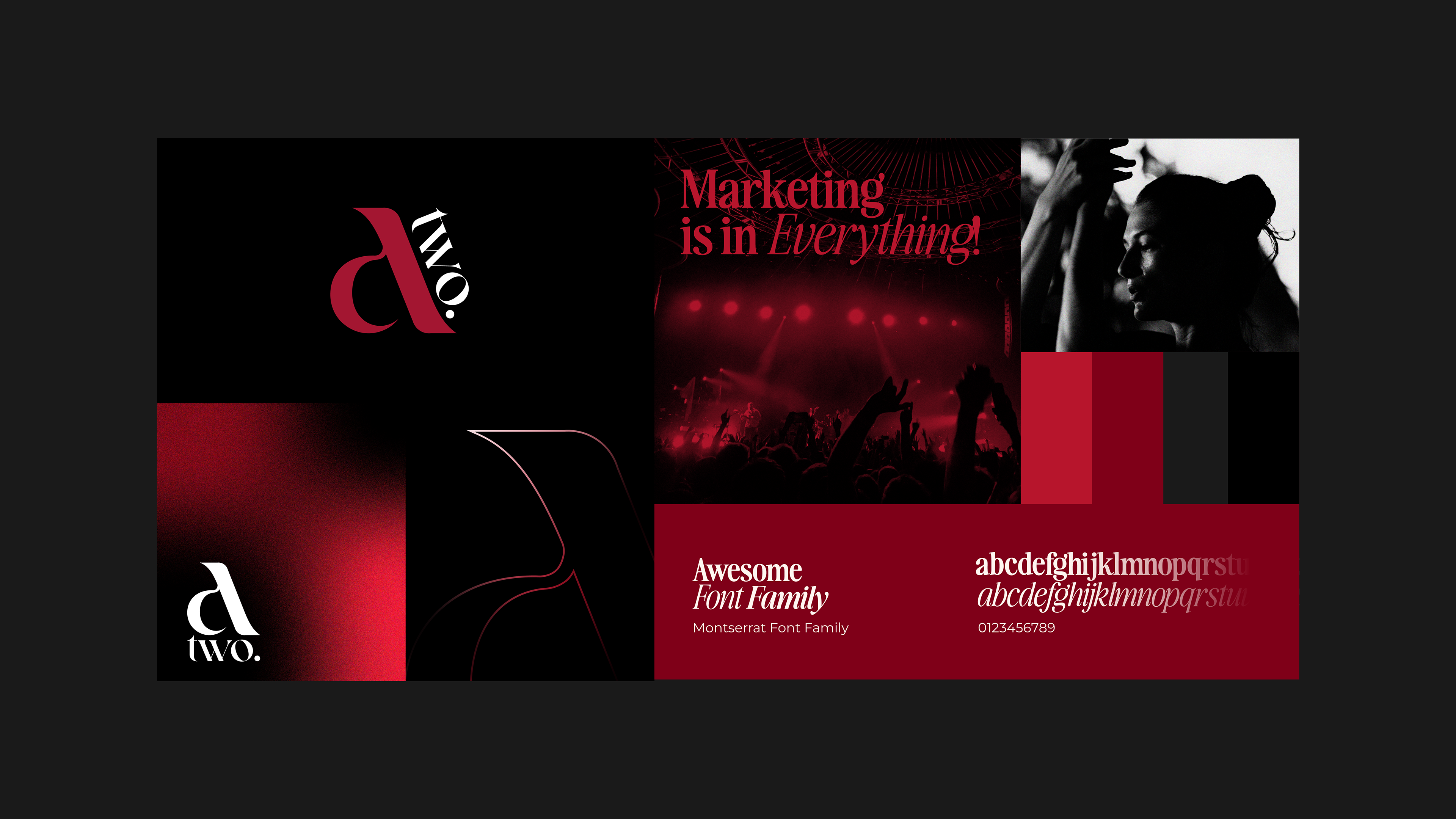
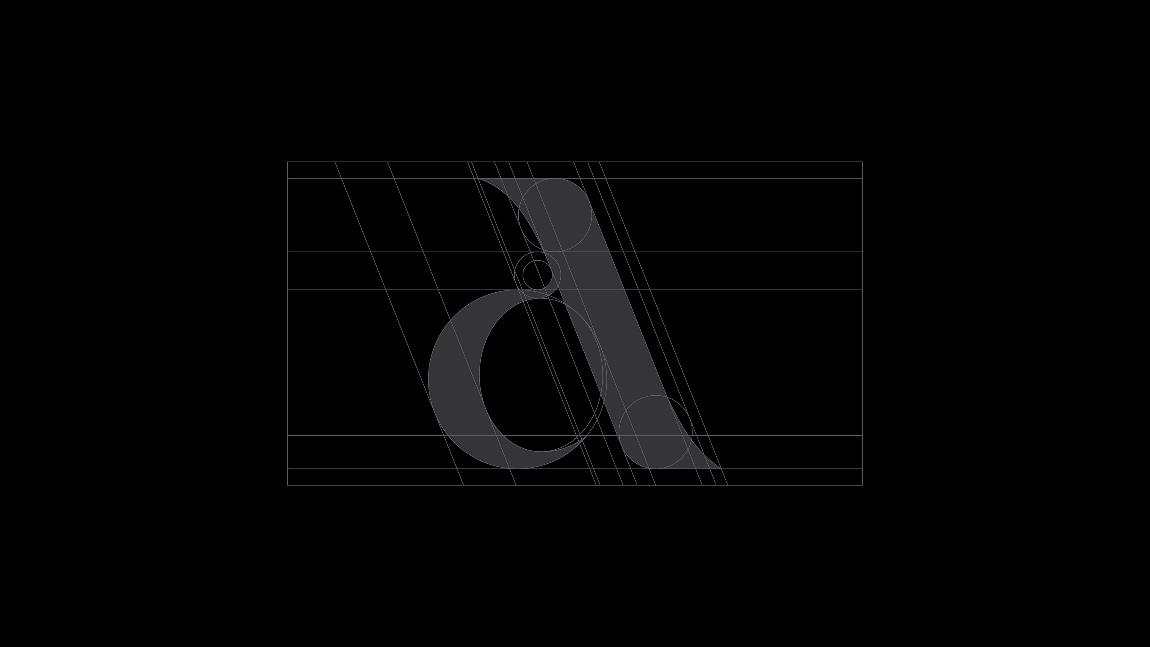
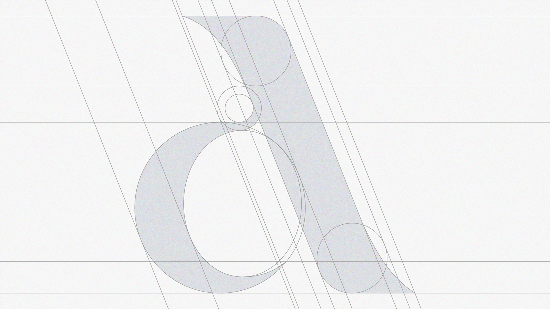
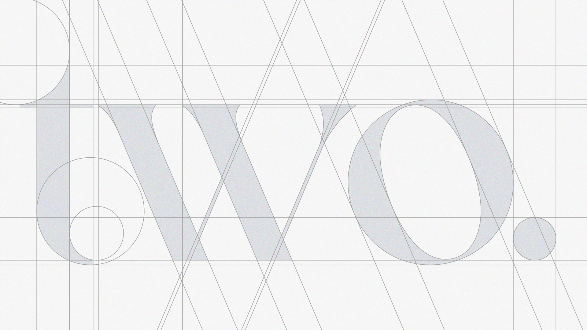
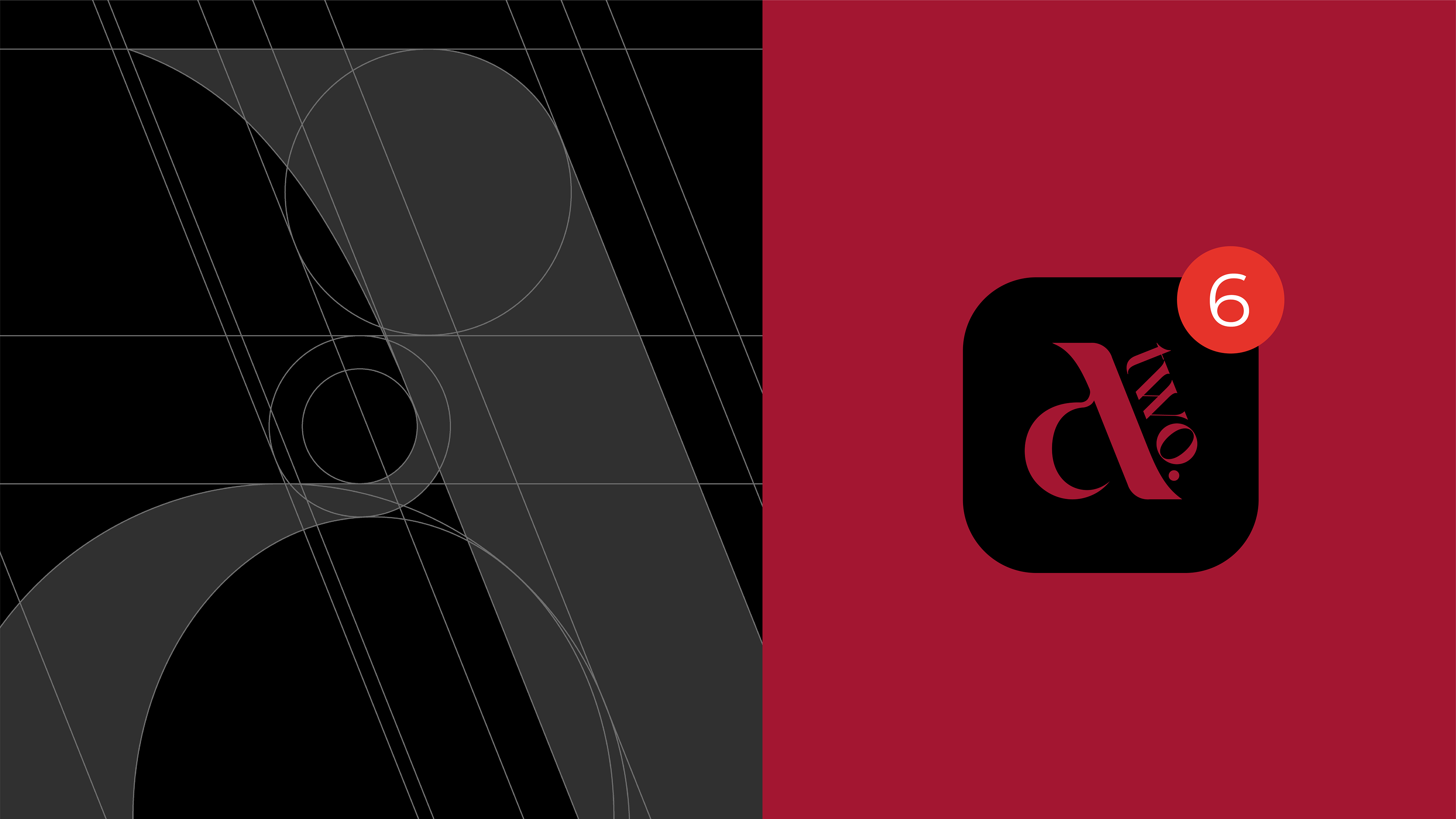
A anatomia da logo é construída com base em uma grade geométrica que utiliza formas circulares e linhas retas para compor seus elementos. O design combina linhas angulares e curvas que oferecem equilíbrio entre força e fluidez. Círculos precisos que formam as extremidades e reforçam a harmonia das proporções. Espaços bem definidos que criam uma estrutura consistente e visualmente agradável. A abordagem geométrica garante elegância, simetria e coerência visual.
EN
The anatomy of the logo is built based on a geometric grid that uses circular shapes and straight lines to compose its elements. The design combines angular and curved lines that offer a balance between strength and fluidity. Precise circles that form the ends and reinforce the harmony of proportions. Well-defined spaces that create a consistent and visually pleasing structure. The geometric approach guarantees elegance, symmetry and visual coherence.
Paleta de Cores
PT-BR
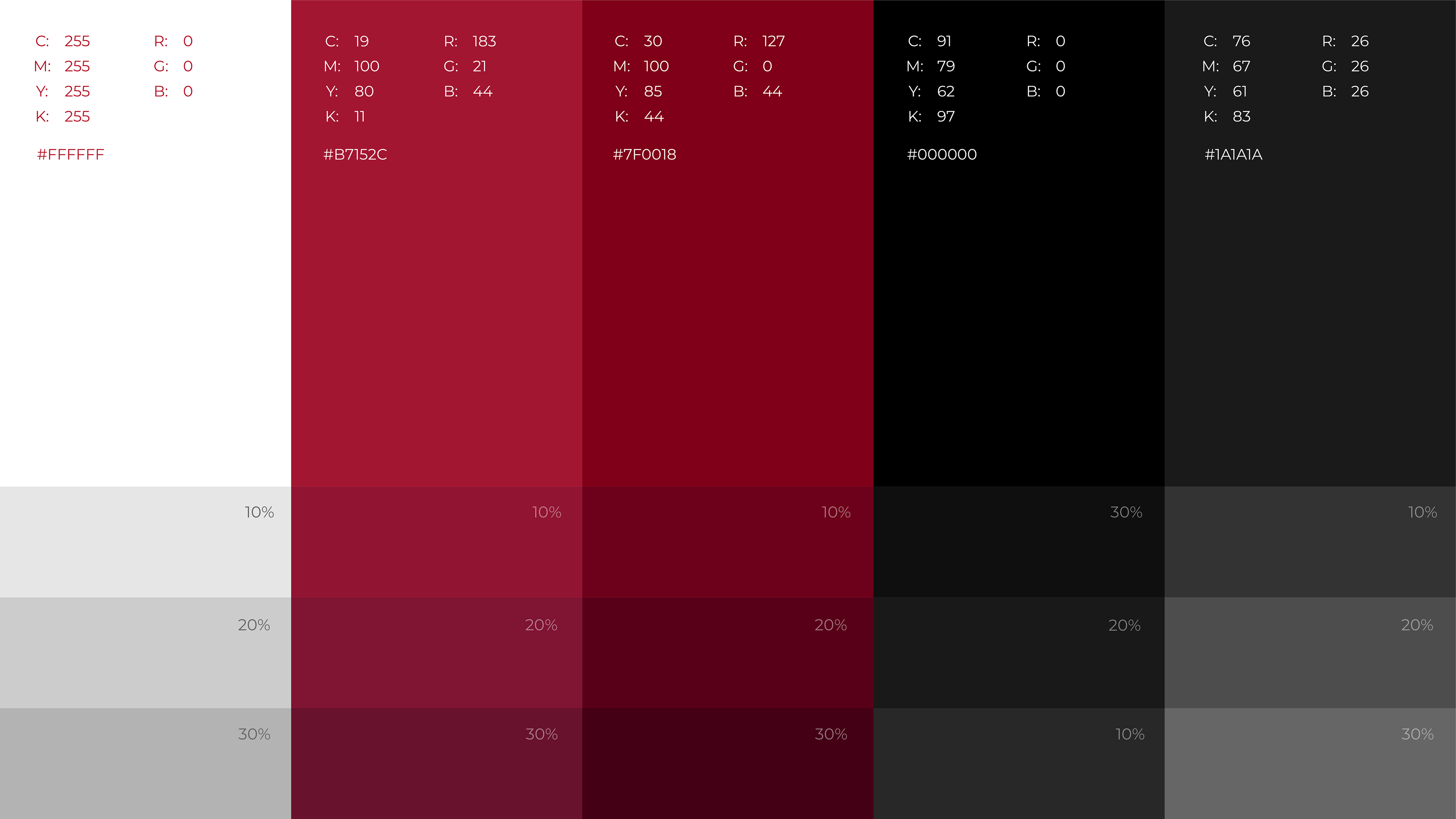
A paleta de cores apresenta o Branco sendo neutro puro, utilizado para contraste e clareza. O Vermelho Vivo tonalidade vibrante e intensa, representando paixão e dinamismo. Com o tom de Vermelho Escuro, mais fechado e sofisticado, ideal para profundidade e destaque. Preto com o neutro absoluto, usado para elegância e impacto visual. O Cinza neutro e refinado, para composições discretas.
Cada cor é apresentada com variações de opacidade (10%, 20% e 30%), permitindo versatilidade no design e integração harmônica com diferentes aplicações.
EN
The color palette features White as a pure neutral, used for contrast and clarity. Vivid Red is a vibrant and intense shade, representing passion and dynamism. With a Dark Red tone, more closed and sophisticated, ideal for depth and highlight. Black with absolute neutral, used for elegance and visual impact. Neutral and refined gray, for discreet compositions.
Each color is presented with opacity variations (10%, 20% and 30%), allowing versatility in design and harmonious integration with different applications.
.
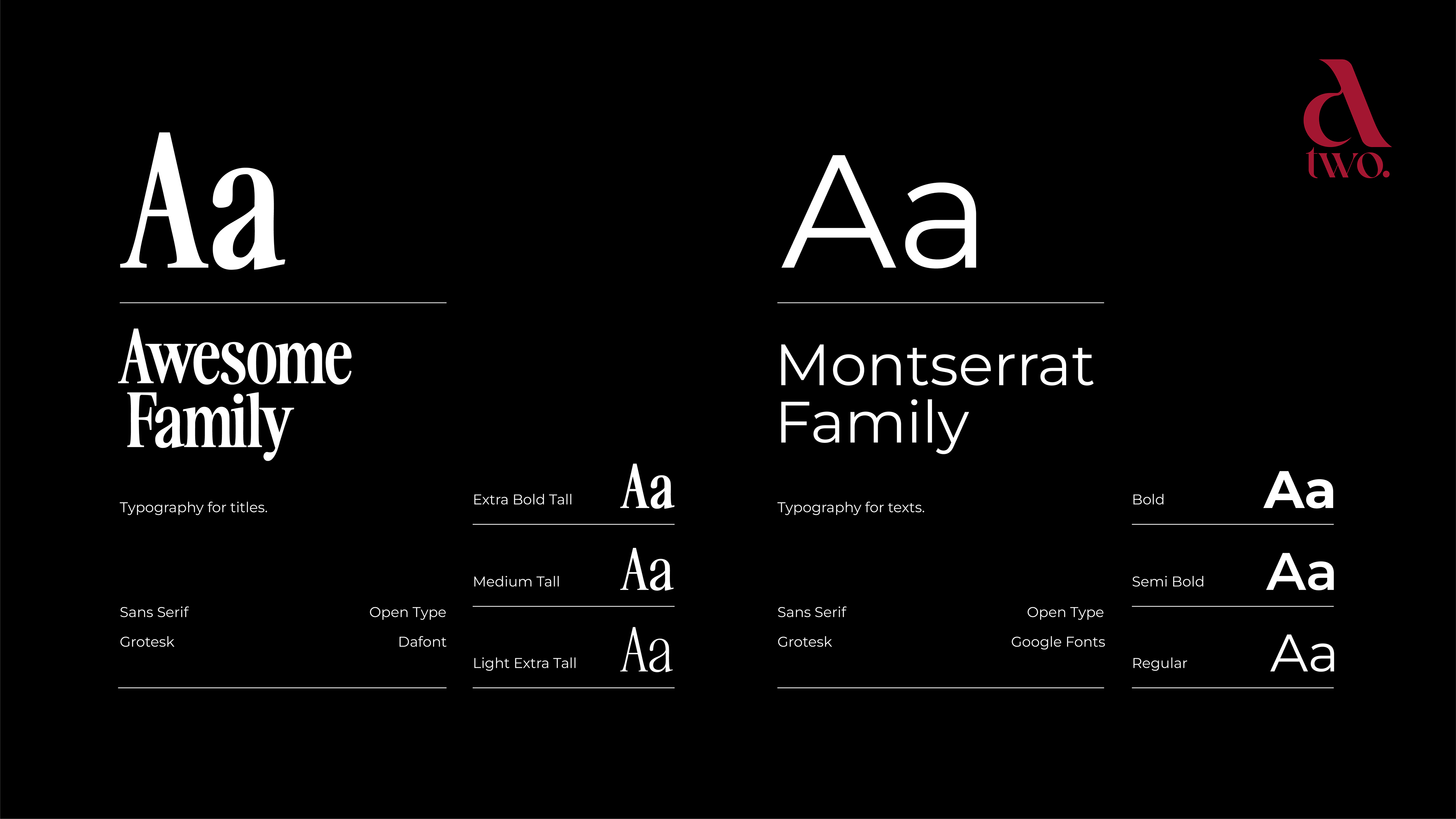
Tipografia
PT-BR
A tipografia exclusiva foi modificada e reconstruída em relação a um grid modular que equilibra formas curvas e retas para transmitir modernidade e proximidade, mas sempre com a sofisticação necessária para refletir a seriedade dos serviços oferecidos pela A TWO. Esses elementos garantem uma identidade visual vintage e versátil, capaz de ser aplicada em diversos contextos e formatos, sem perder a sua essência.
EN
The exclusive typography was modified and rebuilt in relation to a modular grid that balances curved and straight shapes to convey modernity and proximity but always with the necessary sophistication to reflect the seriousness of the services offered by A TWO. These elements guarantee a vintage and versatile visual identity, capable of being applied in different contexts and formats, without losing its essence.
.
.
.
.
.
.
.
.
.
.
.
.
.
.
.
.
.
.
.
.
.
.
.
.
.